Cinema Ticketing App & Website
Project Overview
The Product:
Designing a mobile app and a responsive website for a movie theater. My focus is on ensuring that finding and booking movie tickets is easy for users.
Project Duration:
September 2022 - June 2023
The Problem:
People may have difficulty finding movie showtimes that fit their busy schedule and desire to enjoy movies with friends on weekends. Also, they may find it inconvenient and time-consuming to search for movies that align with their schedule due to their busy life.
The Goal:
Creating a mobile app and a responsive website with personalized recommendations and filters for showtimes could make it easier for users to find suitable movie options that fit their busy schedules, providing a more convenient and enjoyable movie-watching experience.
My Role & Responsibilities:
UX/UI designer
•Conducting user research to understand their needs and preferences.
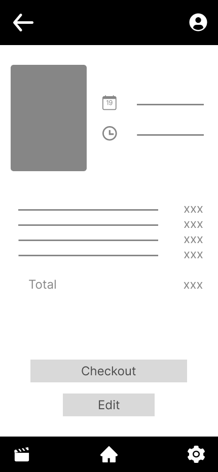
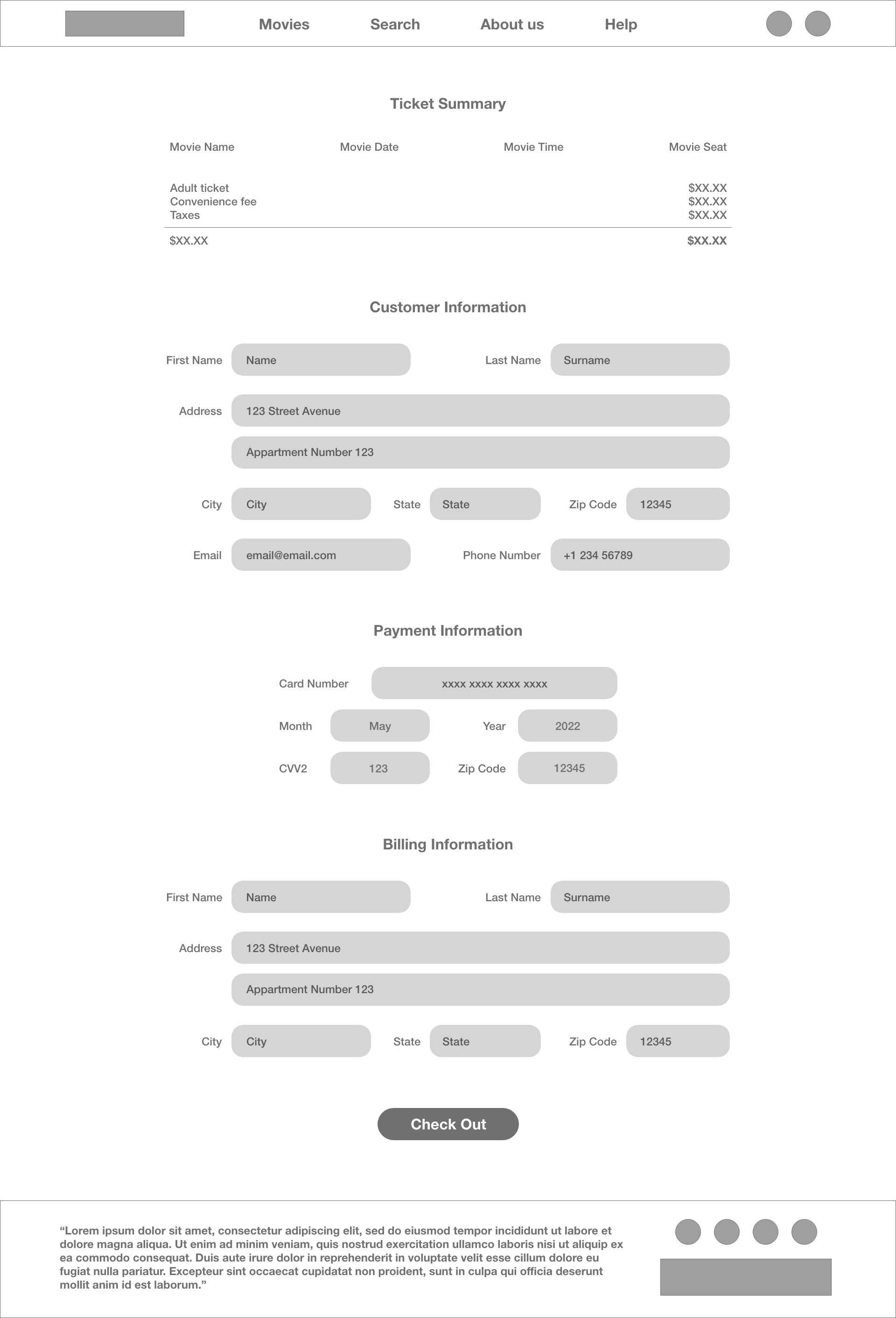
•Designing an intuitive interface for searching, booking, and paying for tickets.
•Creating wireframes, prototypes, and user flows.
•Conducting user testing and analyzing feedback for continuous improvement.
User Research
Summary:
As a UX designer for the movie ticketing app and website, I conducted interviews and empathy maps to understand the needs and frustrations of our target users, with a primary focus on busy adults.
Through this research, we identified that users want a platform that minimizes time spent on utility services, provides affordable and suitable entertainment options, and allows for an easy selection of showtimes and seats. This informed our design decisions and resulted in an app that meets these needs and improves the overall user experience.
Pain Points:
•Time-consuming ticketing: Users frustrated with the amount of time and effort it takes to buy movie tickets, with long lines and a complicated ticketing process.
•Limited movie selection: Users are disappointed by the limited selection of movies available on the app, with a lack of variety and new releases.
•Unreliable seat choices: Users are unhappy with the inability to choose preferred seats and the potential for unreliable seating arrangements.
Persona
Problem statement:
Negar is a computer engineer who needs a movie ticketing app that allows her to easily schedule showtimes and choose her seat because her busy schedule leaves her with limited time and she wants to have control over her movie-watching experience.
User Journey Map:
Analyzing Negar's user journey highlighted the necessity of having a dedicated app for movie ticketing, which would significantly benefit users.


Paper Wireframes
Sketching wireframes for the cinema ticketing app and website involves translating the user requirements and pain points into a visual representation of the interface. The wireframes should prioritize ease of use and provide a streamlined flow for selecting a movie, choosing a suitable showtime and seat, and making a payment. The wireframes should also incorporate improvement opportunities, such as search filters, a review section, and a simple checkout flow, to enhance the user experience and increase engagement with the app
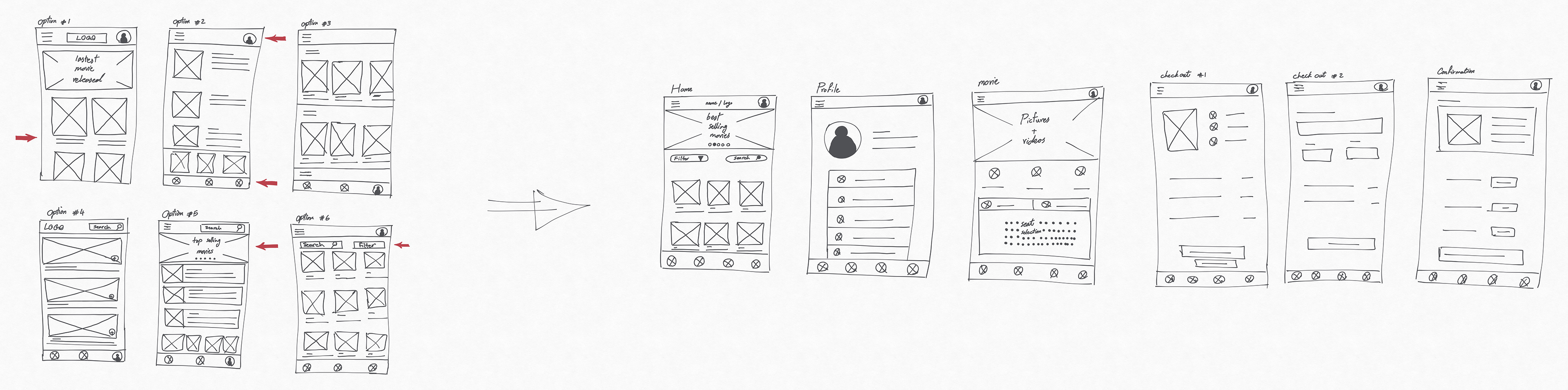
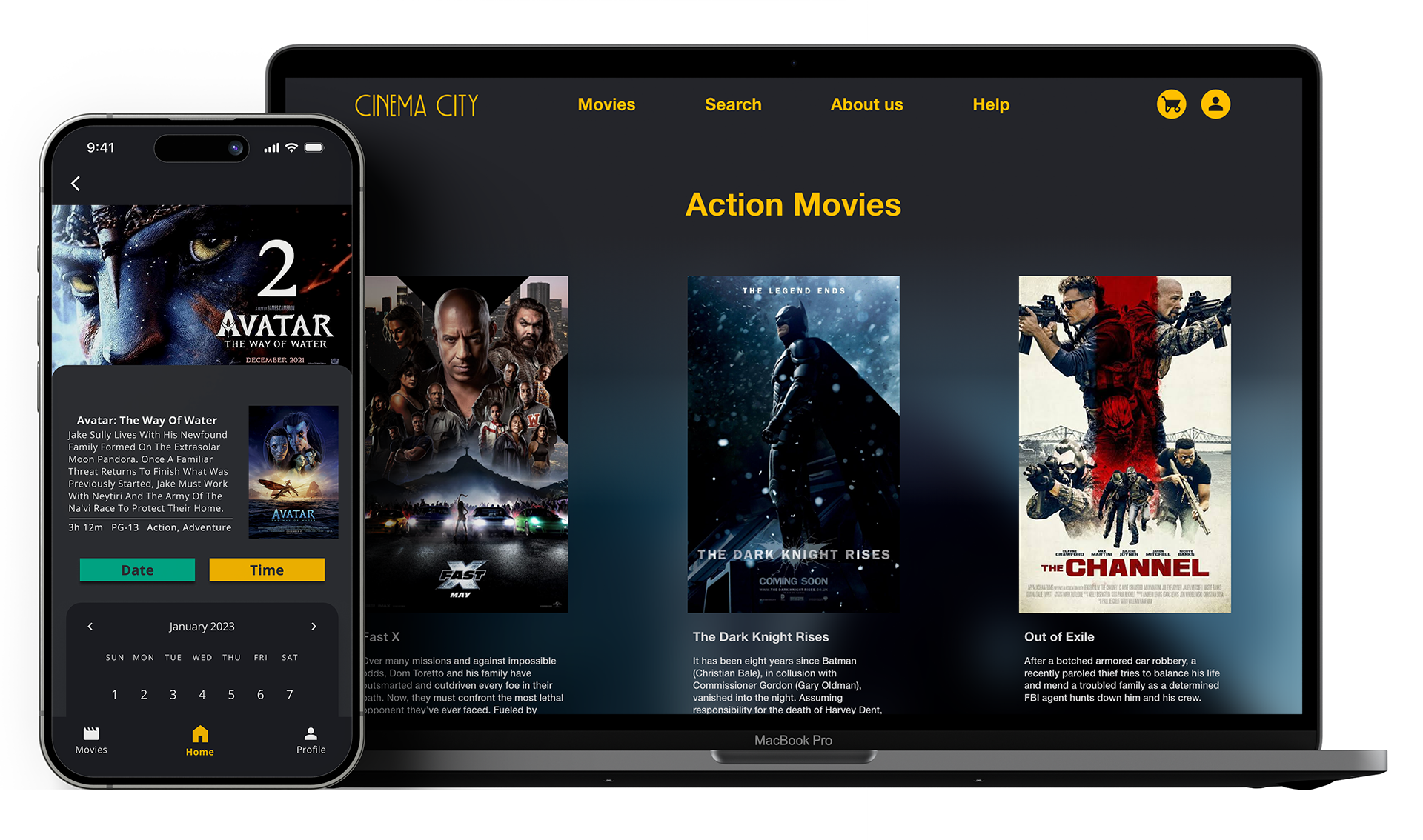
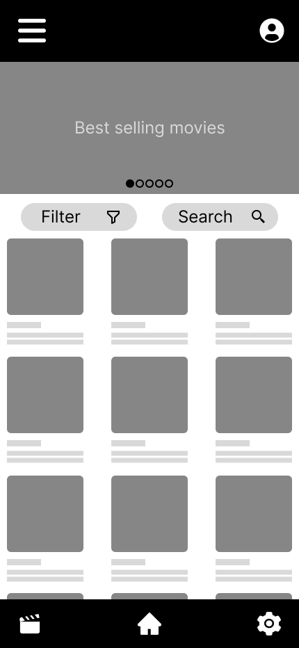
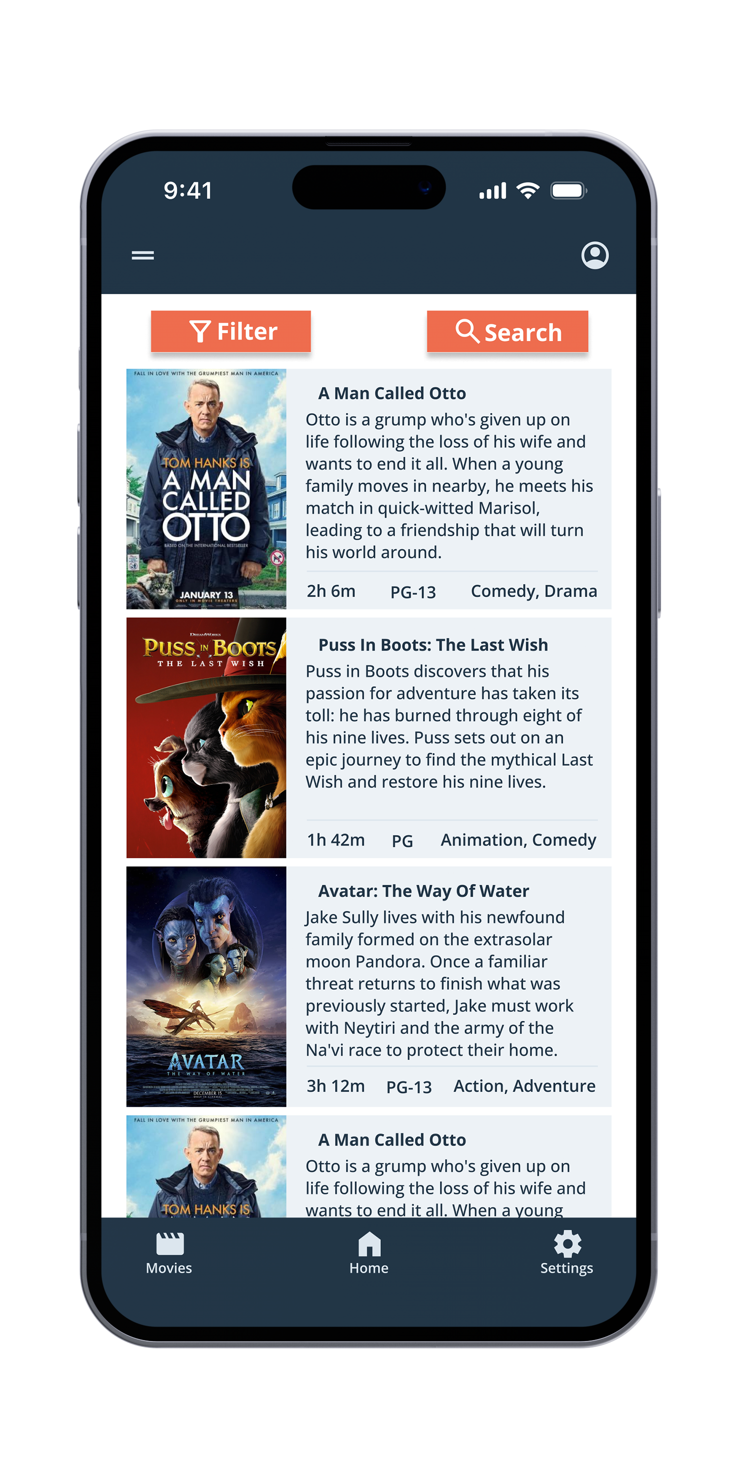
Digital Wireframes
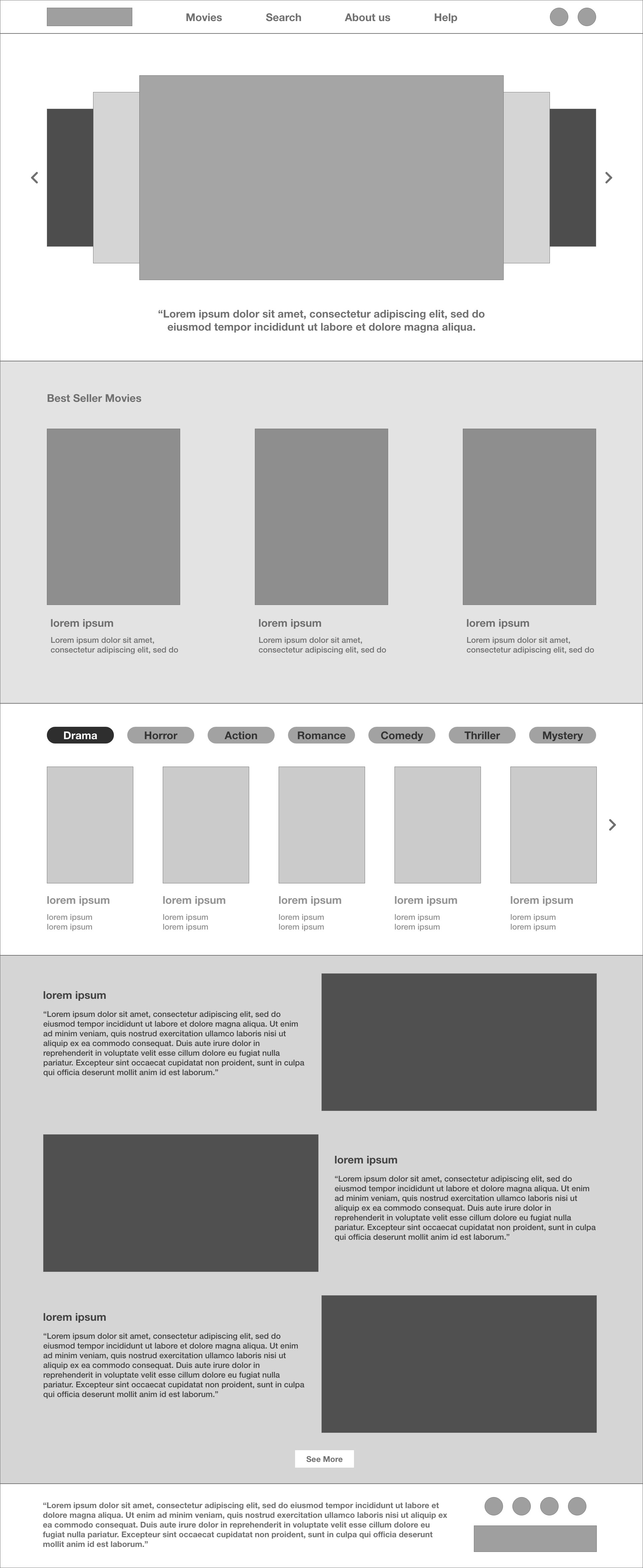
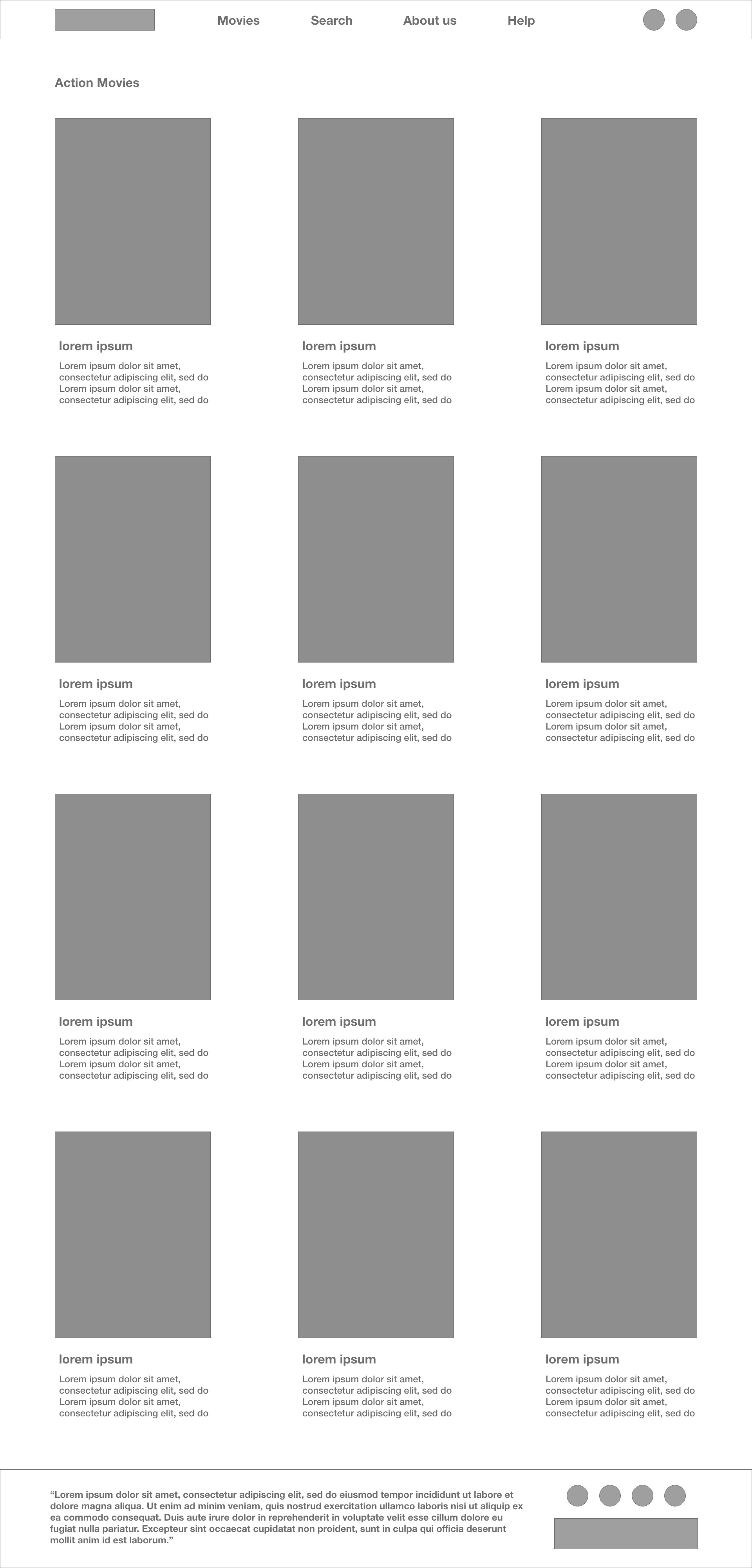
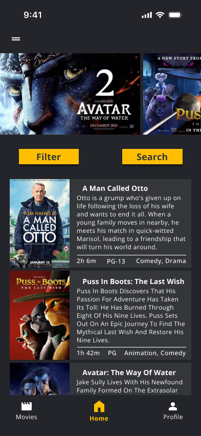
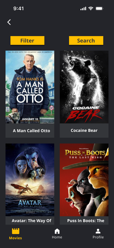
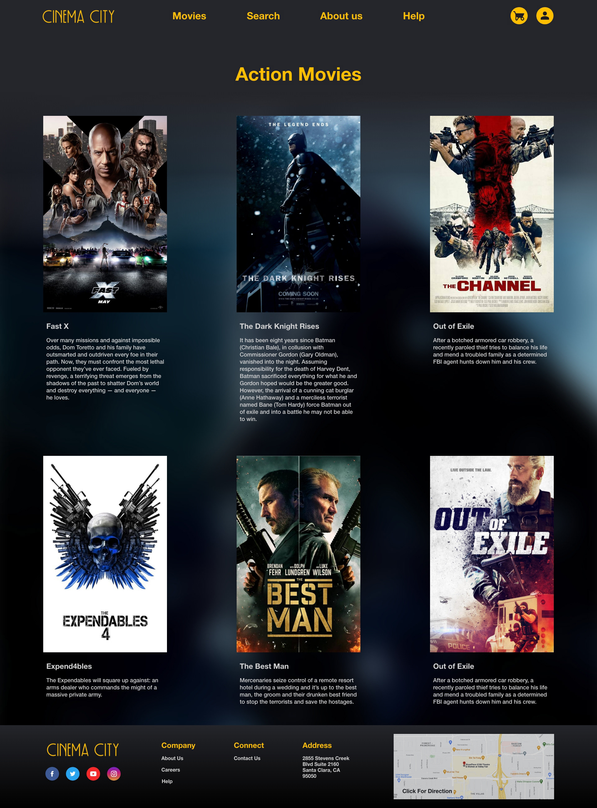
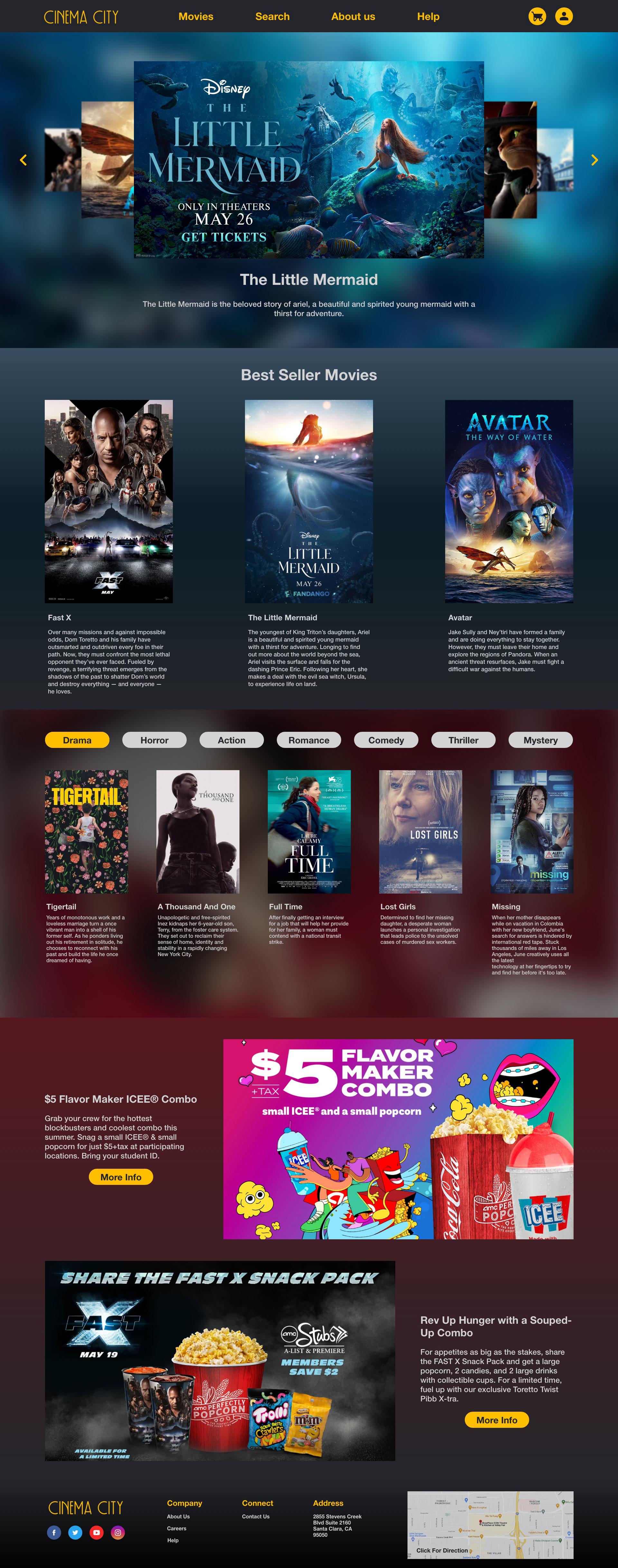
Provide users with easy access to the most commonly used features such as browsing movies, selecting showtimes and seats, and making payments.
The home screen should also be visually appealing and intuitive to use, providing users with a seamless experience that encourages them to explore and use the app.
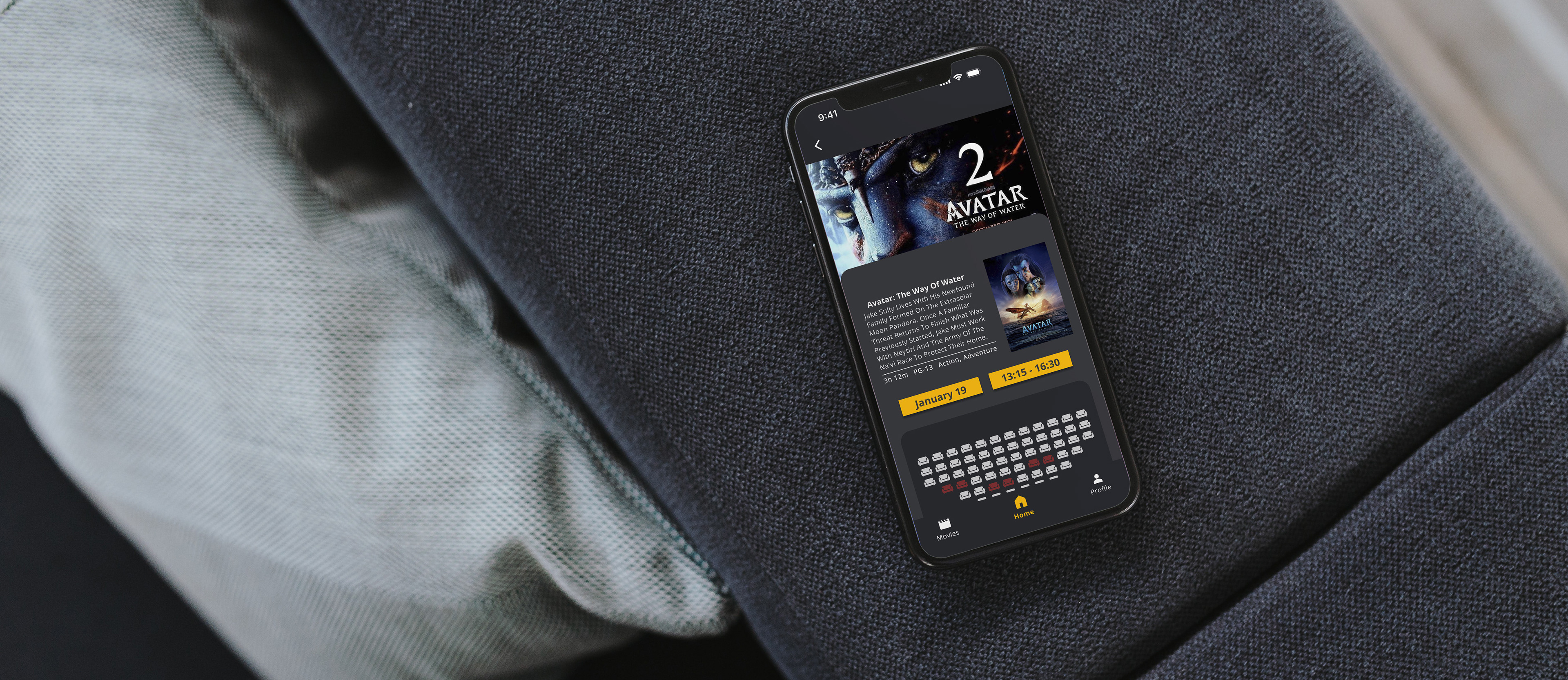
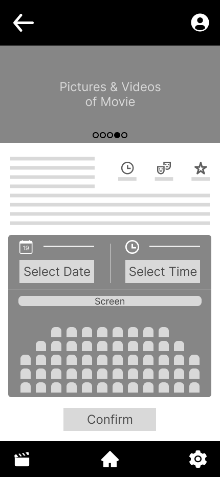
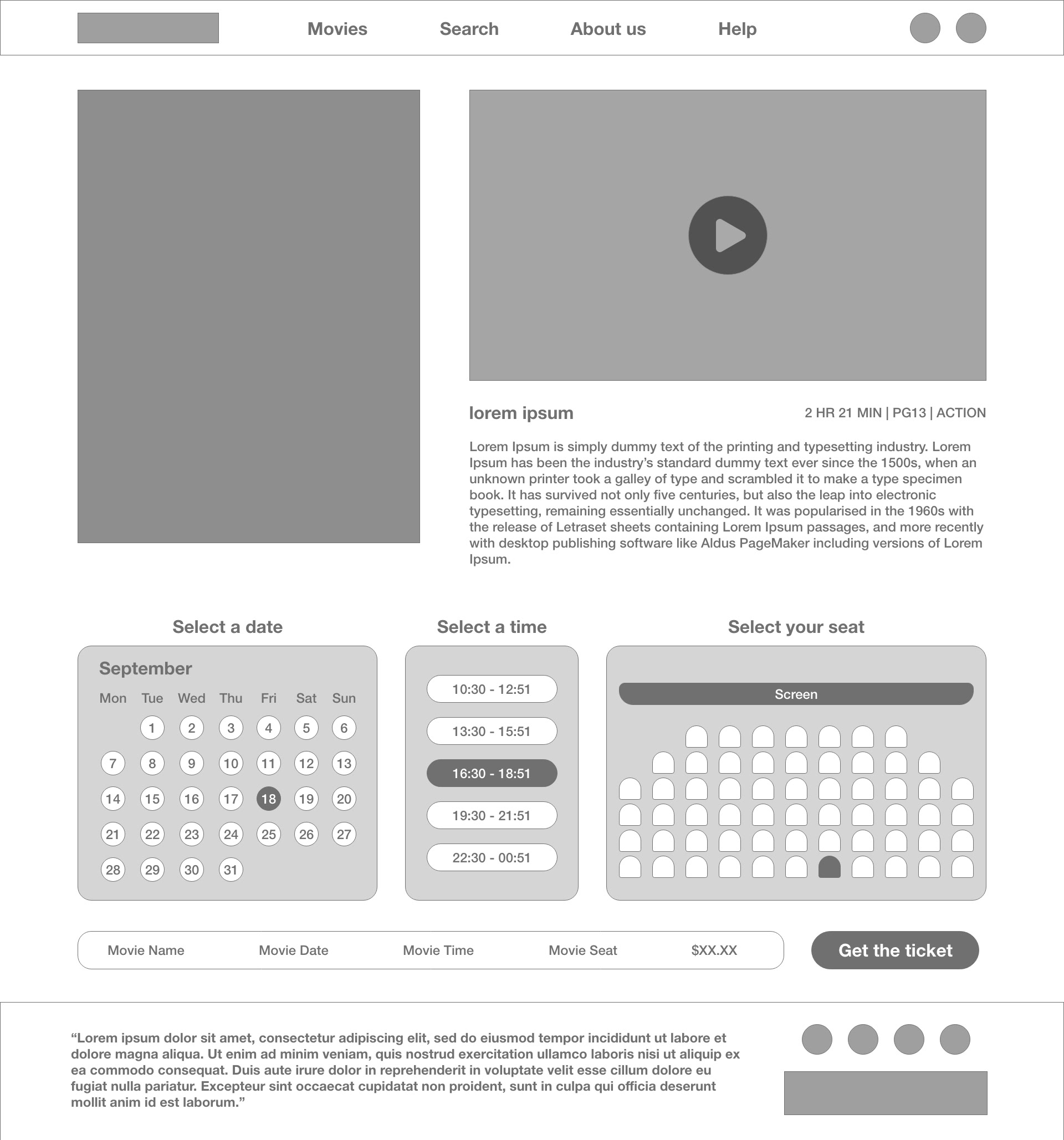
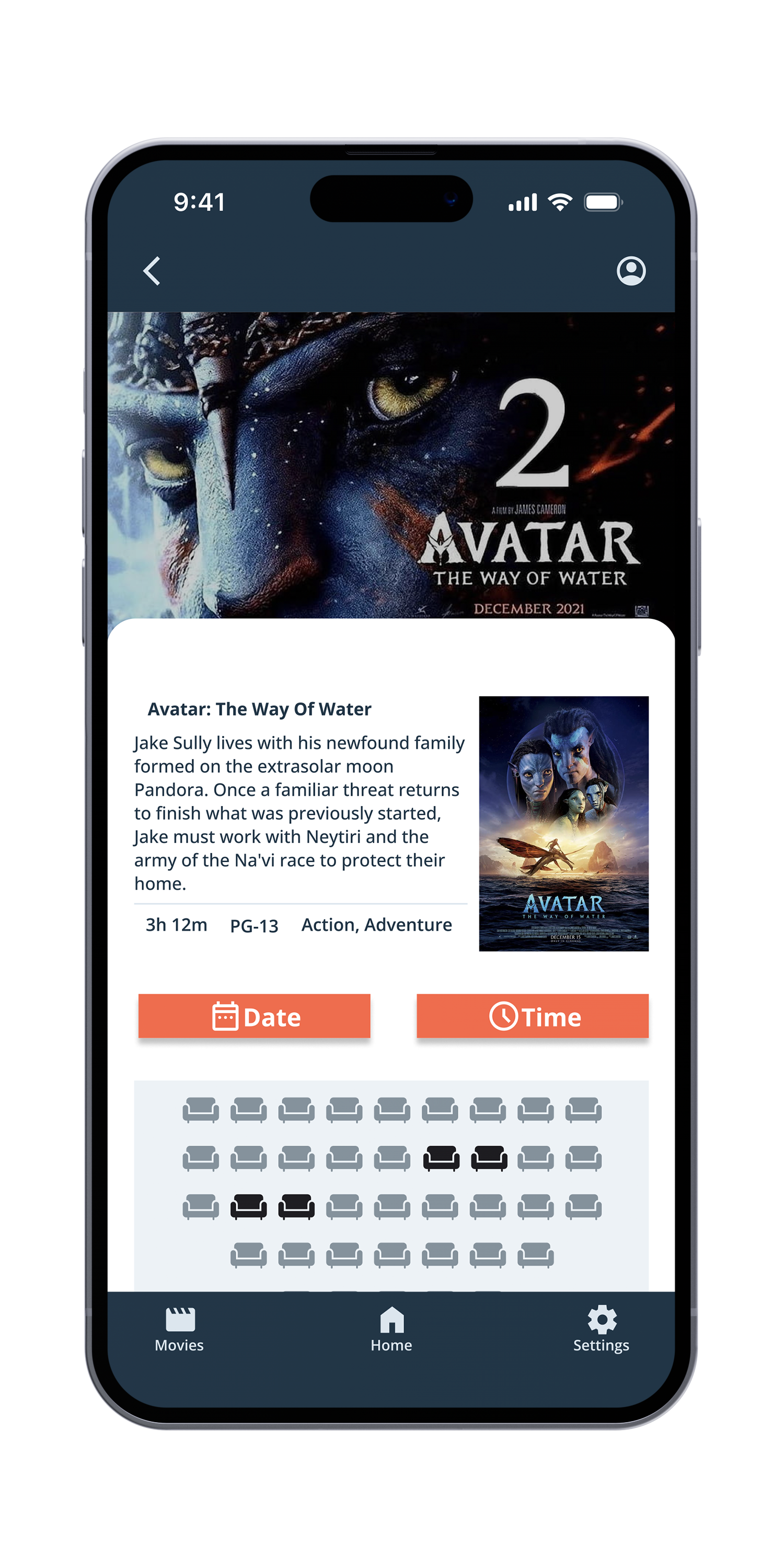
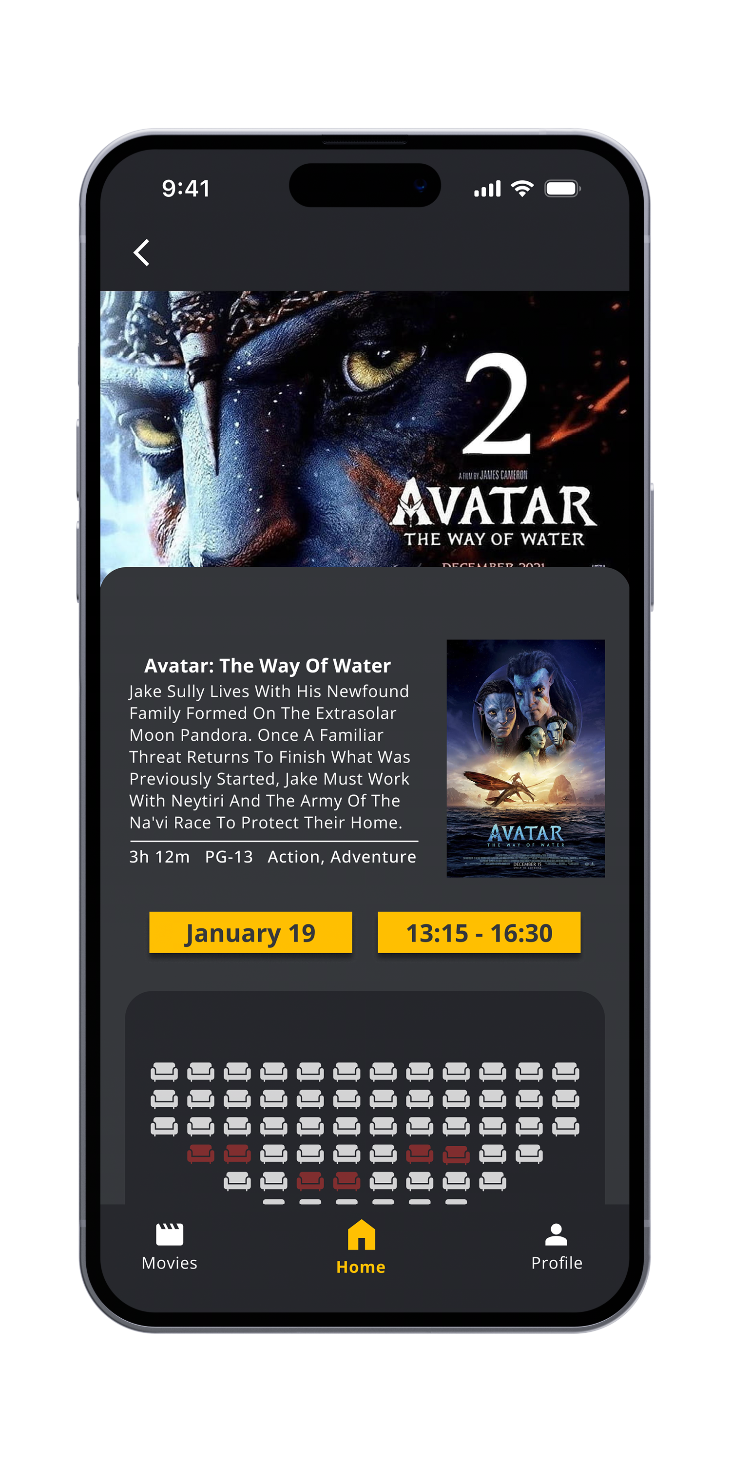
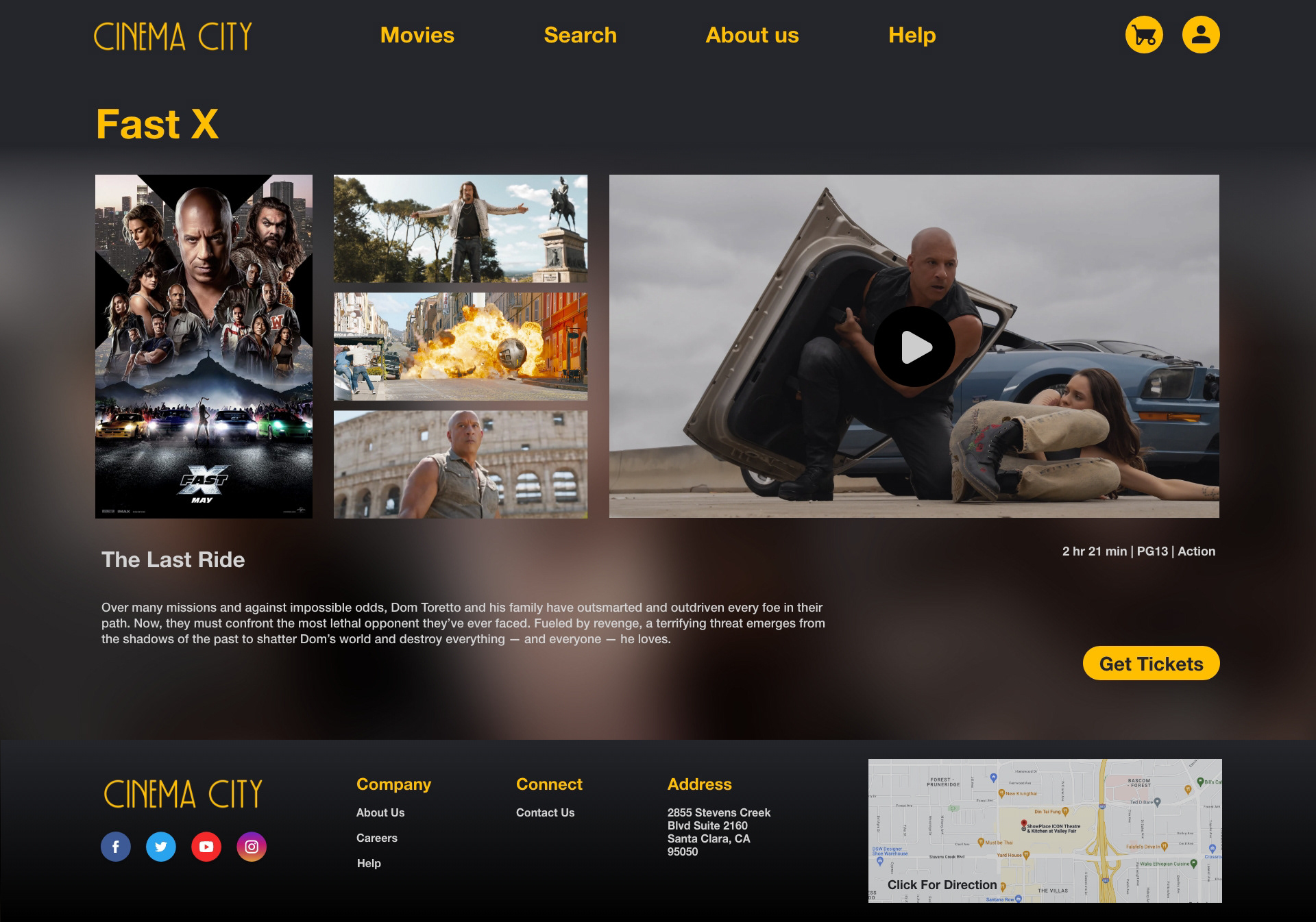
A specific part of the app allows users to make informed decisions about which movie to watch and when, as well as which seats are available.
By providing detailed information about each movie, including ratings, reviews, and summaries, users can quickly decide if a movie is worth watching.
The home screen should also be visually appealing and intuitive to use, providing users with a seamless experience that encourages them to explore and use the app.
A specific part of the app allows users to make informed decisions about which movie to watch and when, as well as which seats are available.
By providing detailed information about each movie, including ratings, reviews, and summaries, users can quickly decide if a movie is worth watching.


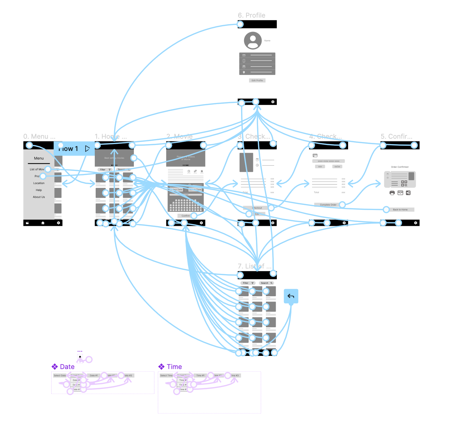
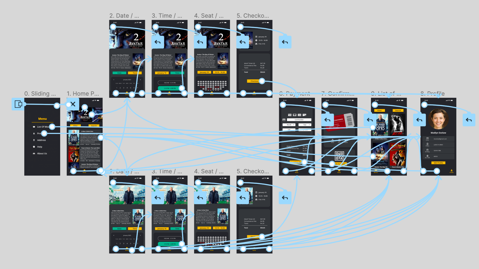
Low-fidelity Prototype
Using the digital wireframes created, a low-fidelity prototype was developed for the cinema ticketing app. The prototype was designed to include the primary user flow of searching for a movie, selecting a showtime and seat, and completing the ticket purchase.
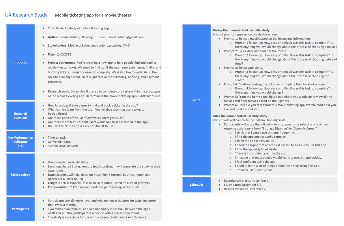
Usability Study
Usability studies were conducted in two rounds with participants performing tasks related to finding a movie, choosing a seat, and purchasing a ticket. The findings highlighted several pain points, including confusing navigation and difficulties in choosing a seat. The results were used to iterate on the design and improve the user experience.
Study Type: Unmoderated usability study
Participants: 6 Participants
Location: USA & Canada - Remote
Length: 25-40 minutes
Findings:
•Users want to see the monthly calendar to choose a specific date and time.
•Users want to sort movies by release date and filter them by genre.
•Users want to know the number of available seats and easily distinguish them from occupied ones.
•Icons are a bit confusing.
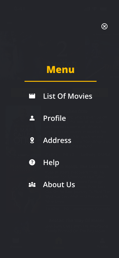
•The sliding menu is not user friendly and it seems a bit tricky
Before Usability Study
After Usability Study
Before Usability Study
After Usability Study
Mockups
After conducting usability studies, I made revisions to the design of the cinema ticketing app. To address the confusion users had with choosing a specific date and time, I added a monthly calendar to the interface to make it easier for users to select the right showing time.
To improve the ease of use for users, I added a more visible and intuitive icon for the list of movies section based on the insight that most users found it difficult to locate. Additionally, users wanted to be able to sort movies by release date and filter them by genre, so I included sort and filter buttons to provide these options.
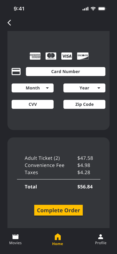
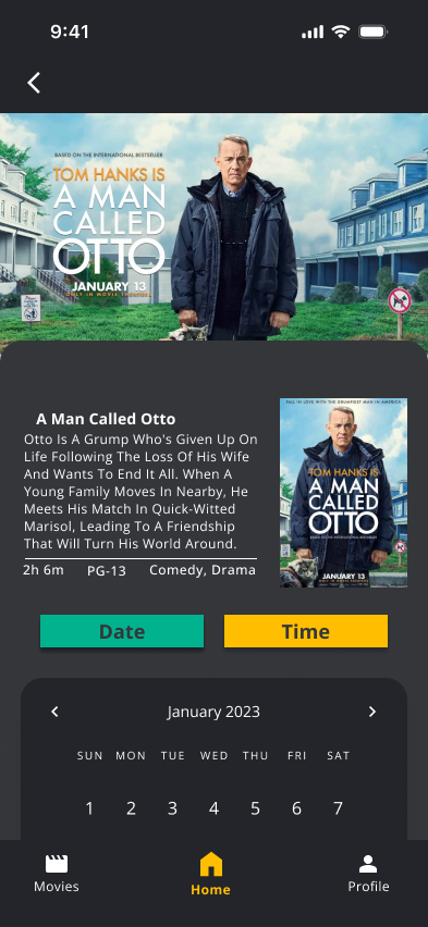
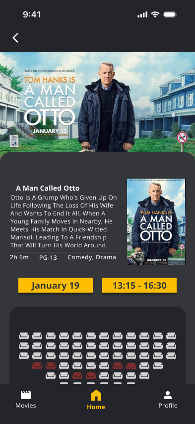
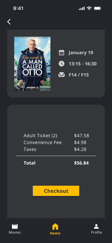
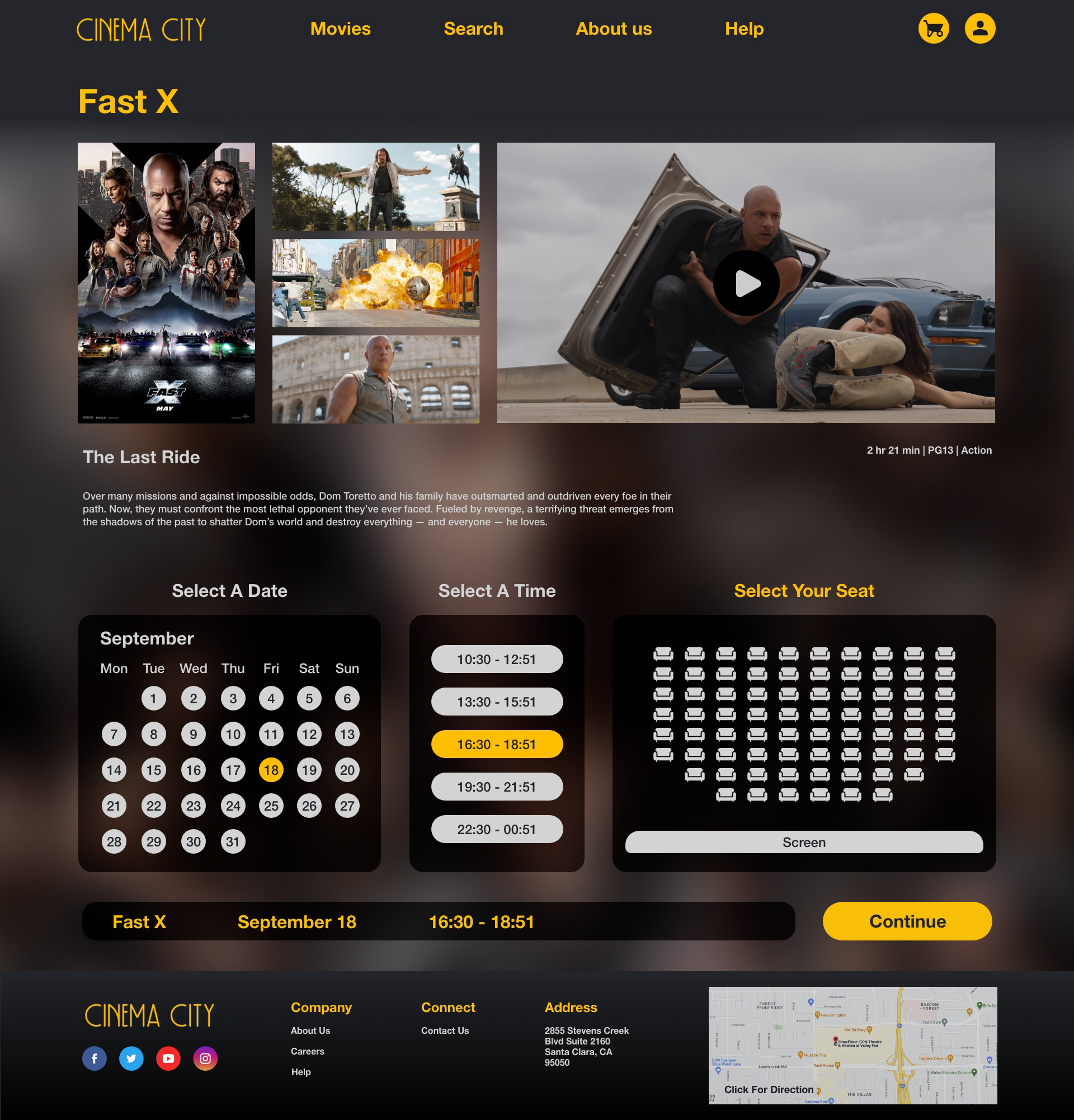
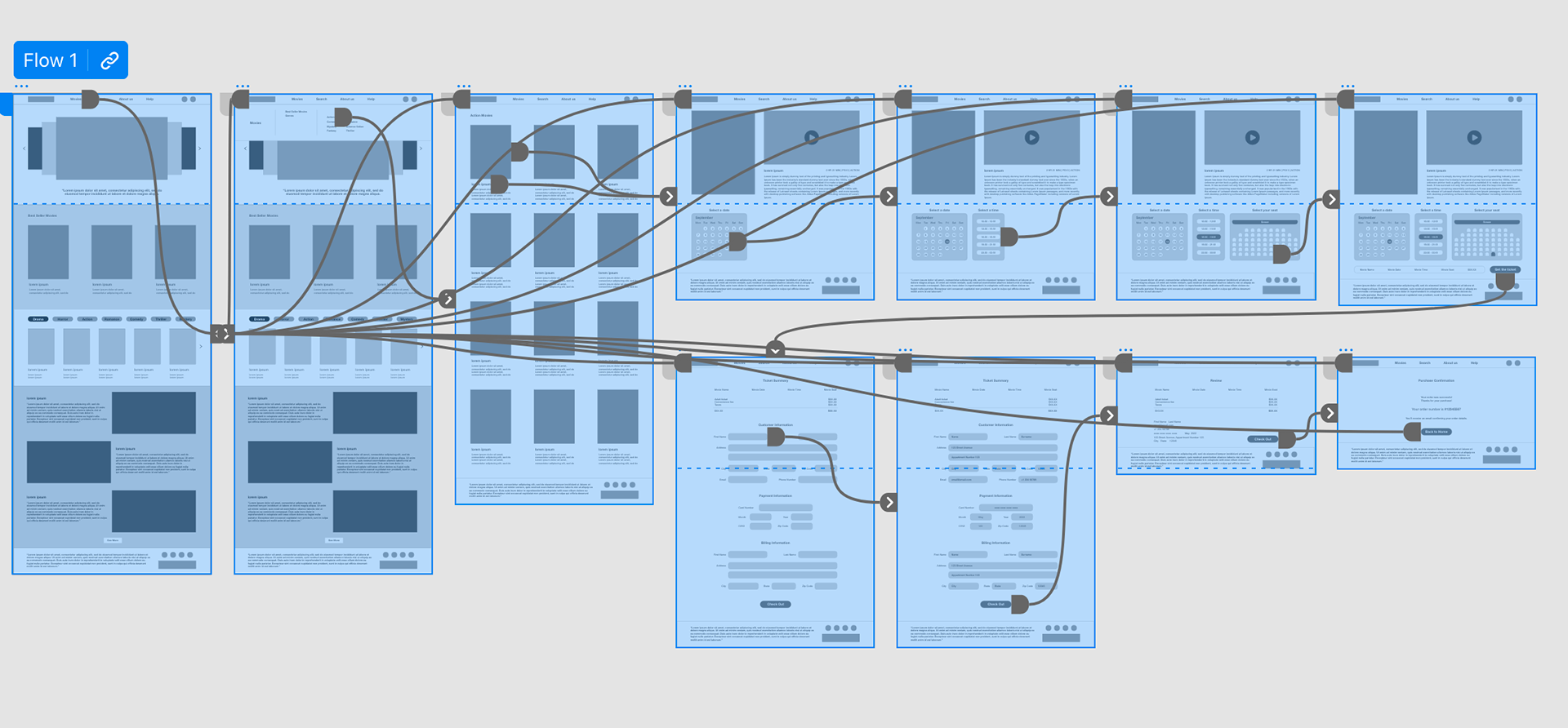
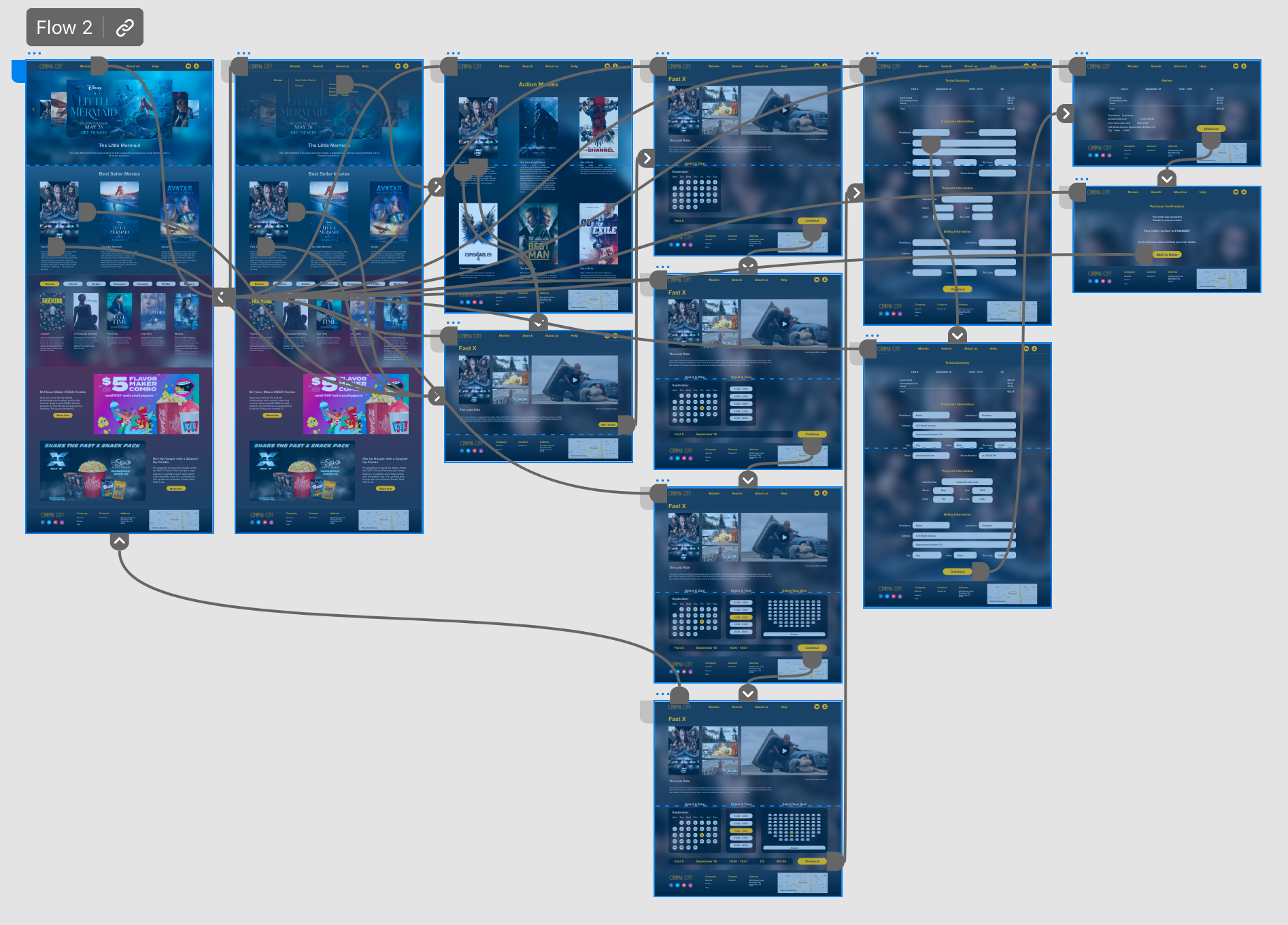
High-fidelity Prototype
Improved high-fidelity prototype for the cinema ticketing app provided better user flows for selecting movies and checking out, along with meeting user needs for sorting and filtering movies and a better icon placement for the list of movies section.
Accessibility Consideration
•Ensured sufficient color contrast between text and background to improve readability for users with visual impairments.
•The app utilized iconography to make navigation easier and more intuitive for users of all abilities.
•Used clear and concise language in all content to make it easier for users with cognitive or reading disabilities to understand the app.
Takeaways
Impact:
The app's user-centric design approach successfully meets users' needs and provides a satisfying experience.
What I learned:
I gathered user insights to improve my app's design, making it more user-friendly and accessible. Constantly iterating based on feedback helped me create an app that truly meets users' needs
Next Steps
Step 1:
Conducting additional usability studies to gather more feedback from users and make data-driven design decisions.
Step 2:
Continuously iterating and improving the app based on user feedback to ensure it remains user-friendly and accessible.
Step 3:
Adding new features to improve the user experience and meet the evolving needs of users.