Recovery Pal! App
Project Overview
The Product:
The app aims to assist runners in preventing, identifying, and rehabilitating common running injuries. It utilizes AI technology to provide personalized injury detection, treatment recommendations, and tailored rehabilitation plans. With a user-centric interface, the app offers educational resources, exercise tutorials, and a supportive community for runners of all levels, promoting safe training practices and facilitating a smooth path to recovery.
Project Duration:
July 2023 - November 2023
The Problems:
•Lack of accessible and personalized resources for runners to identify and address common running injuries.
•Limited guidance and support for runners seeking to rehabilitate effectively and prevent recurring injuries.
•Insufficient technological solutions that integrate AI for early injury detection and customized rehabilitation plans.
•Inadequate user-friendly platforms that offer holistic training guidance and educational resources for runners of all levels.
The Goals:
•Create an intuitive and AI-driven platform that aids in early injury detection and provides tailored rehabilitation guidance.
•Develop a comprehensive resource hub for runners, offering personalized training plans and educational content on injury prevention and recovery.
•Foster an engaging and supportive community for runners to share experiences, insights, and best practices for injury management and prevention.
•Provide a user-friendly interface that encourages regular engagement, progress tracking, and seamless integration of rehabilitation routines into runners' daily lives.
My Role & Responsibilities:
UX/UI designer
•Conducted in-depth user research and analysis to identify pain points and user requirements within the running community.
•Utilized wireframes, prototypes, and user flows to create and test design concepts, incorporating user feedback and industry best practices for optimal usability and accessibility.
•Implemented a user-centric approach to design, focusing on personalized rehabilitation plans, interactive features, and informative content to enhance user engagement and promote long-term adherence to the app.
•Conducted regular usability tests and iterations to refine the app's interface, ensuring that it met the highest standards of functionality, aesthetic appeal, and overall user satisfaction.
User Research
Summary:
During the app user research phase, I conducted a combination of qualitative and quantitative studies, including interviews, surveys, and usability testing, to gain insights into the needs and pain points of the running community. Initially, I assumed that runners primarily sought basic injury prevention information, with a focus on physical exercise routines. However, through the research process, I discovered that many users also desired comprehensive guidance on injury identification, personalized rehabilitation plans, and a supportive community for shared experiences. This shift in understanding highlighted the importance of integrating AI-driven tools for injury detection and tailored rehabilitation guidance, as well as fostering an interactive platform that encourages user engagement and long-term adherence to rehabilitation routines.
Pain Points:
•Difficulty in identifying and diagnosing specific running-related injuries without professional guidance.
•Limited access to comprehensive rehabilitation resources and personalized treatment plans.
•Lack of user-friendly platforms integrating AI technology for early injury detection and targeted guidance.
•Inadequate support and engagement within the running community for sharing experiences and best practices in injury management and prevention.
Persona
Problem statement:
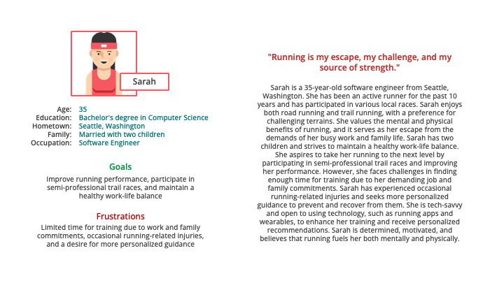
Sarah, a busy software engineer and dedicated runner, seeks an app for personalized rehabilitation, treatment, and physical therapy. With a demanding schedule, Sarah needs efficient recovery solutions that fit her busy lifestyle, prevent injuries, and help her excel in her running pursuits.
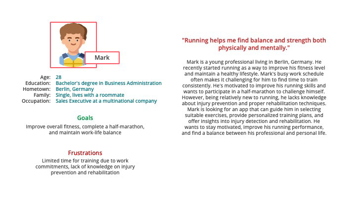
Mark, a busy professional, wants an affordable app that offers at-home rehabilitation guidance and personalized training plans. He seeks to improve his fitness, recover from injuries, and achieve his running goals independently and cost-effectively.
User Journey Map:
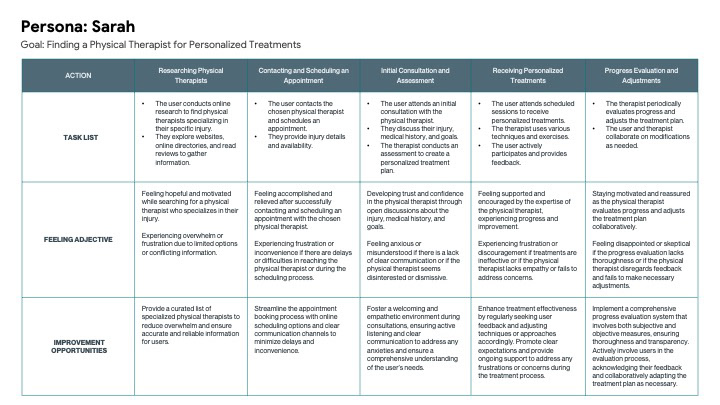
This user journey map (Sarah) focuses on the user's experience in finding a physical therapist for personalized treatments. The user starts by researching physical therapists, seeking recommendations, and gathering information. They then contact and schedule an appointment with a chosen physical therapist. During the initial consultation and assessment, the user discusses their injury, medical history, and goals, and a personalized treatment plan is developed. The user attends sessions to receive treatments, and progress evaluations are conducted periodically to ensure adjustments are made as needed. This user journey map highlights the need for trust, effective communication, and ongoing collaboration between the user and the physical therapist for successful rehabilitation and treatment.
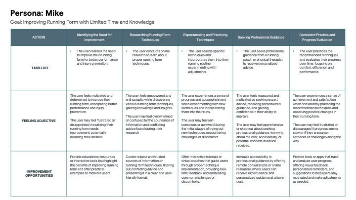
This user journey map (Mike) focuses on the user's experience in improving running form with limited time and knowledge. The user begins by recognizing the need for improvement and conducts research to learn about proper running form techniques. They then experiment and practice these techniques during their runs. Seeking professional guidance, the user consults with a running coach or physical therapist to receive personalized advice. Consistent practice and evaluation of progress are key, with the user incorporating recommended techniques and monitoring changes in comfort, efficiency, and performance. This user journey map emphasizes the importance of research, practice, professional guidance, and self-evaluation in achieving improved running form.
Competitive Audit
During the competitive audit, I thoroughly examined similar apps and platforms within the sports injury rehabilitation domain. This process involved assessing their user interfaces, feature sets, and overall user experiences. By identifying strengths and weaknesses in their design and functionality, I gained valuable insights into industry trends and user expectations. This enabled me to position my app strategically, emphasizing its unique value propositions and addressing any gaps or opportunities within the market.
Paper Wireframes
I crafted initial paper wireframes to outline the app's structure and key features. These quick sketches helped visualize the user interface and streamline the design process.
Digital Wireframes
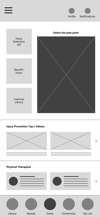
The home page digital wireframe focuses on creating an intuitive and welcoming user interface, featuring easy navigation, prominent call-to-action buttons, and clear sections outlining key app functionalities. By prioritizing accessibility and user engagement, the wireframe emphasizes personalized rehabilitation plans, injury detection tools, and a user-friendly exercise library. Additionally, the inclusion of interactive elements encourages user interaction and fosters a sense of community within the app.
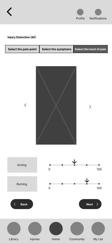
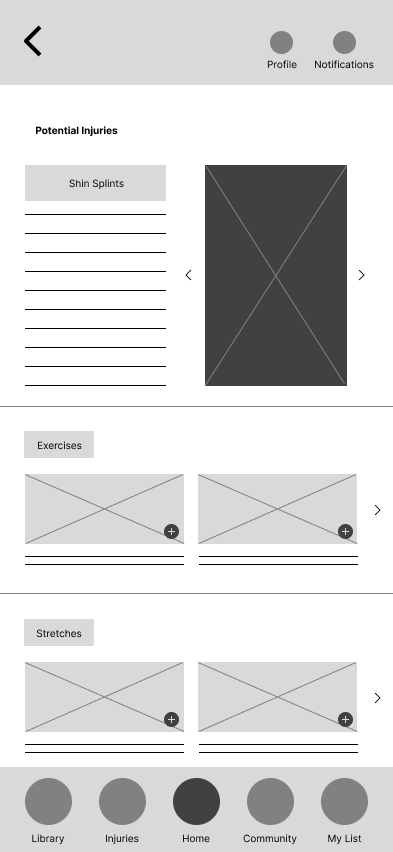
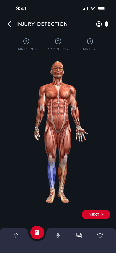
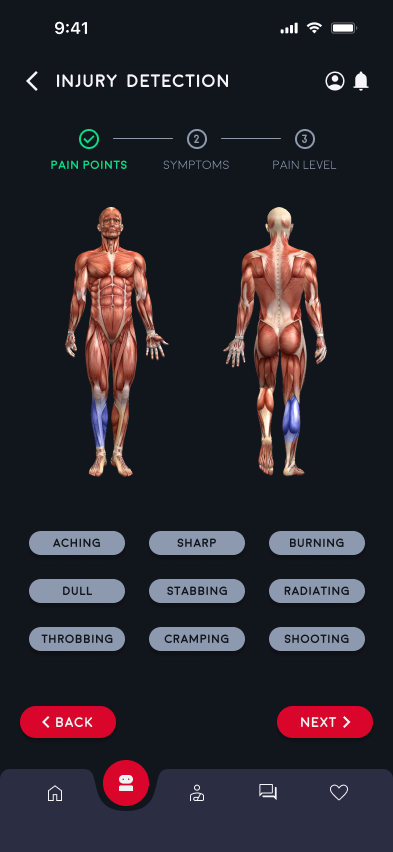
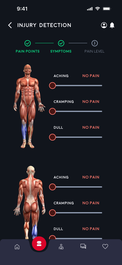
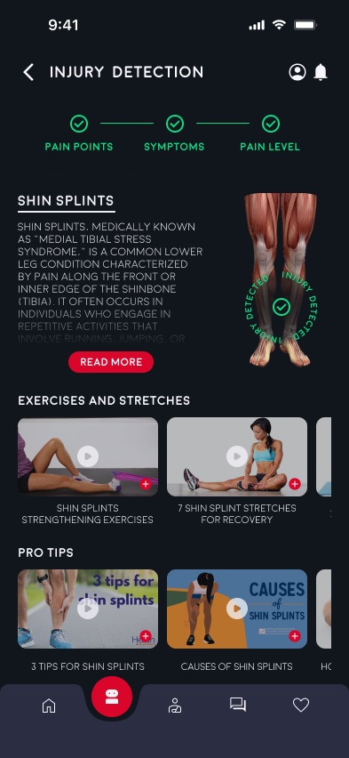
The injury detection tools with AI are designed to offer users a seamless and efficient way to identify potential running-related injuries. The injury detection tools provide a user-friendly interface for inputting symptoms, analyzing data, and generating comprehensive injury reports. With intuitive visualizations and real-time feedback, users can receive personalized recommendations for next steps in their rehabilitation journey, fostering a proactive and informed approach to injury management.
Low-fidelity Prototype
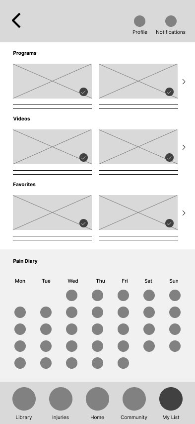
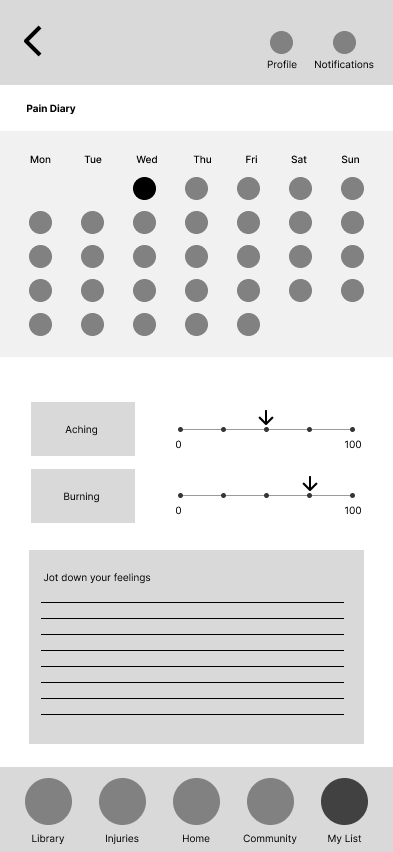
In the low-fidelity prototype phase, I focused on creating a simplified version of the app interface, prioritizing functionality and user flow over visual aesthetics. This initial design iteration allowed for rapid testing and feedback collection, enabling seamless adjustments to the app's structure and navigation. Through the use of basic shapes, placeholders, and minimal color schemes, I emphasized core features such as injury identification, exercise library access, and personalized rehabilitation plans. This approach facilitated a clear understanding of the app's basic layout and functionality, laying the groundwork for subsequent iterations and the development of a more polished high-fidelity prototype.
Usability Study
I conducted usability studies to gather insights and improve user experience. Findings emphasized the need for intuitive injury detection, streamlined exercise library navigation, and an enhanced overall app experience for increased engagement. Subsequent iterations prioritized addressing these findings, aligning the app with evolving user needs.
Study Type: Unmoderated usability study
Participants: 5 Participants
Location: CA, USA - Remote
Length: 30-45 minutes
•Participants appreciated the personalized rehabilitation plans, emphasizing the effectiveness of tailored guidance in their recovery journey.
•Users found the injury detection process intuitive and user-friendly, leading to quick and accurate results.
•Navigating the exercise library was challenging for some users, highlighting the need for improved categorization and search functionality.


Mockups
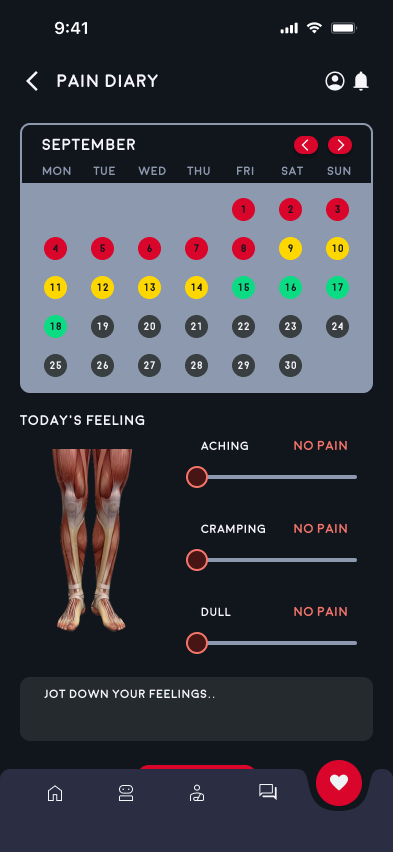
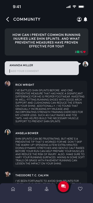
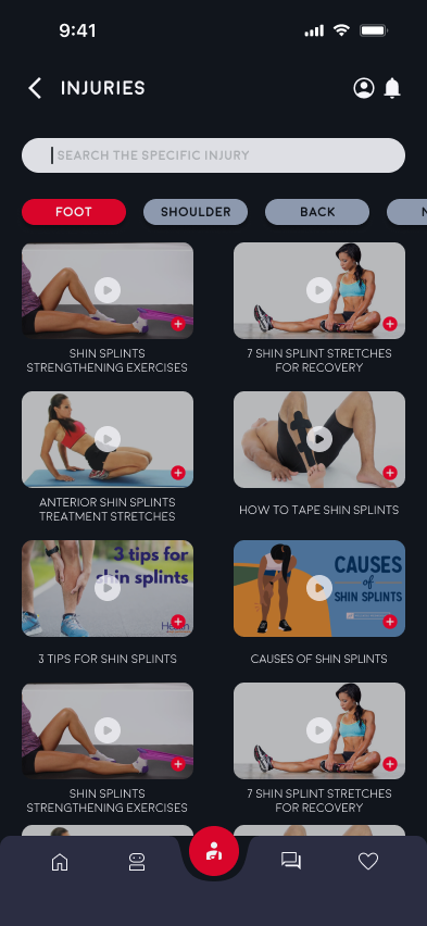
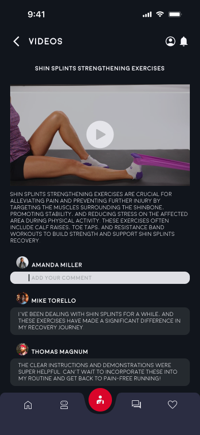
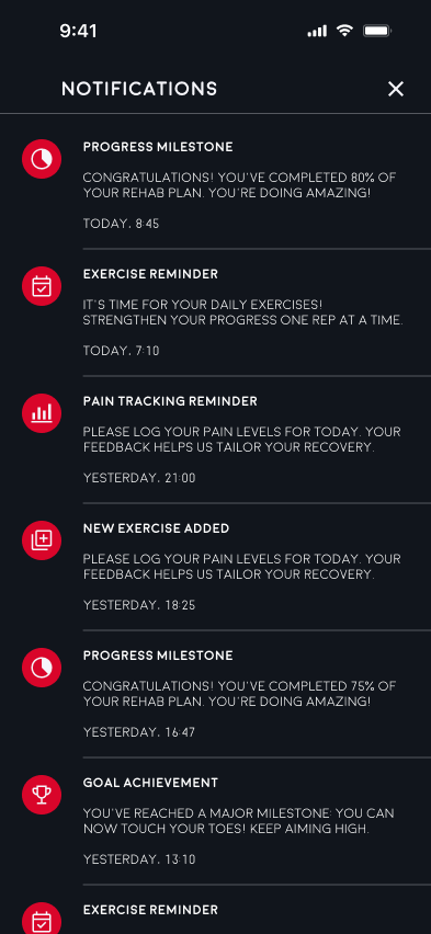
Following the usability study, I swiftly incorporated the user feedback into the mockups, addressing specific pain points and enhancing the overall user experience. By refining the app's interface, restructuring the injury detection section, and implementing improved navigation features, I ensured a more intuitive and user-friendly design. This iterative process aimed to align the app with user expectations and preferences, facilitating smoother interactions and fostering a stronger connection between the app and its users.
Post-usability study, I promptly acted on user suggestions, making necessary adjustments to the mockups. Enhancements included improved categorization in the exercise library, streamlined navigation for a more intuitive user experience, and an optimized interface design to foster greater engagement. These changes were aimed at cultivating a seamless and user-friendly platform, catering to the specific needs and preferences of the app's target audience.




High-fidelity Prototype
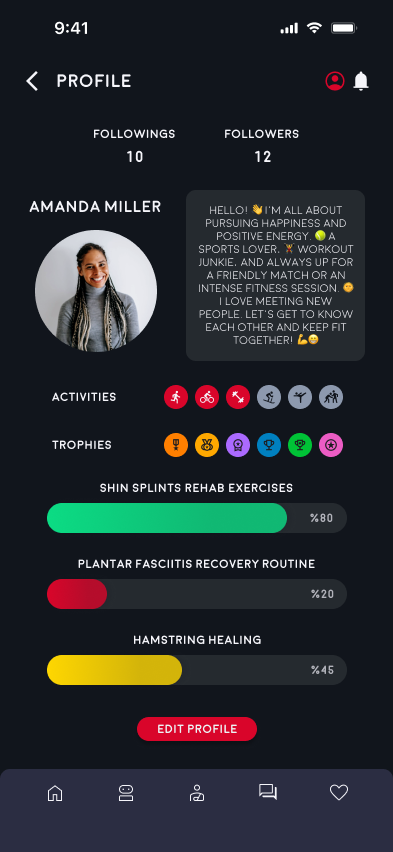
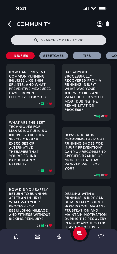
In the high-fidelity prototype phase, I concentrated on refining the visual elements and interactive components, creating a polished and immersive user experience. By integrating vibrant colors, crisp typography, and intuitive navigation, I aimed to evoke a sense of professionalism and user engagement. The high-fidelity prototype also emphasized seamless interactivity, offering users a comprehensive and visually appealing platform that facilitated easy access to injury detection tools, personalized rehabilitation plans, and an extensive exercise library. This stage marked the transformation of conceptual ideas into a sophisticated and user-centric interface, laying the foundation for a robust and visually captivating final product.
Accessibility Consideration
•Implementing an initial focus on the home screen ensures that personalized recommendations are easily accessible and define the primary task for users. This enhances the overall user experience and streamlines interactions for individuals with varying abilities.
•Incorporating clear and descriptive labels for all interactive elements within the app ensures seamless navigation and usability for users relying on screen readers. By providing comprehensive descriptions for buttons, menus, and other functionalities, the app promotes inclusivity and accessibility for all users.
•Employing a well-contrasted color scheme for the interface elements, including buttons and labels, improves visibility and readability for users with visual impairments. By ensuring a sufficient contrast ratio between text and background colors, the app enhances legibility and accessibility, allowing all users to engage with the content effortlessly.
Takeaways
Impact:
The usability studies and feedback integration significantly improved the app's user experience, reinforcing the importance of user-centric design.
The usability studies and feedback integration significantly improved the app's user experience, reinforcing the importance of user-centric design.
What I learned:
•Importance of iterative design and incorporating user feedback for continuous improvement.
•Significance of prioritizing accessibility considerations in design to foster inclusivity.
•Value of intuitive and user-friendly interfaces in encouraging sustained user interaction and engagement.
•Importance of iterative design and incorporating user feedback for continuous improvement.
•Significance of prioritizing accessibility considerations in design to foster inclusivity.
•Value of intuitive and user-friendly interfaces in encouraging sustained user interaction and engagement.
Next Steps
Step 1:
Conduct comprehensive user testing to refine functionality, usability, and accessibility.
Conduct comprehensive user testing to refine functionality, usability, and accessibility.
Step 2:
Continuously iterate on the app's interface based on user feedback and emerging industry trends.
Continuously iterate on the app's interface based on user feedback and emerging industry trends.
Step 3:
Collaborate with healthcare professionals and potential partners to enhance the app's credibility and expand its reach within the running community.
Collaborate with healthcare professionals and potential partners to enhance the app's credibility and expand its reach within the running community.