
One Platform to Build It All
The Challenge
Our bootcamp team set out to design Building A Better Brand® (BABB), an all-in-one platform for entrepreneurs and small businesses who were stuck using too many tools that didn’t really connect. The goal was to make their brand-building journey easier, more organized, and smarter.
Why We Needed to Fix This
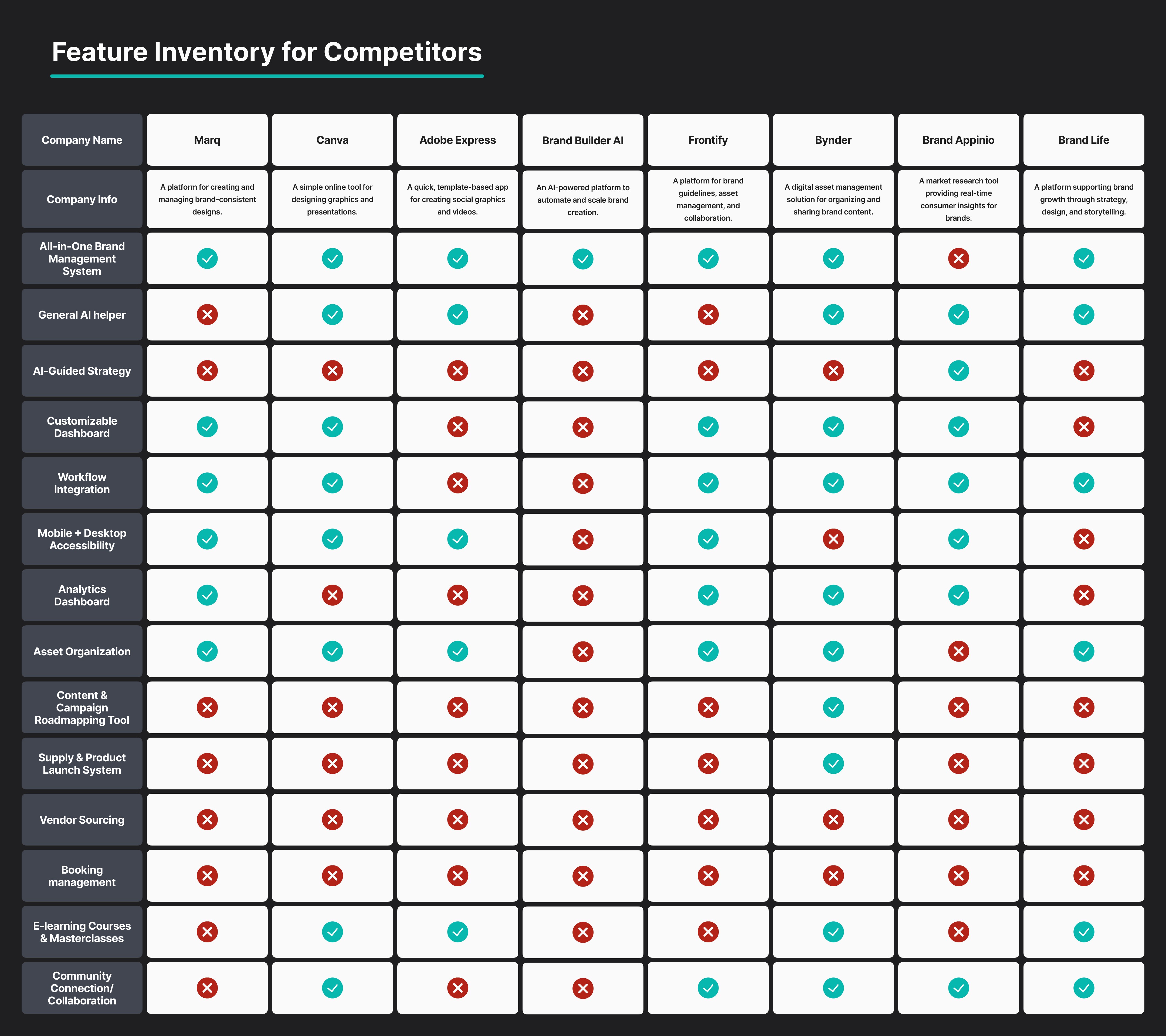
We were asked to solve a messy and frustrating problem: users had to jump between Canva, Google Docs, ClickUp, and tons of other apps just to manage their brand. There was no clear system to keep everything together. As Lead UX Designer, my job was to figure out how to design a smooth, simple platform that gave users exactly what they needed — all in one place. The product needed to handle branding, strategy, content creation, finances, and even AI-powered help.
Listening First, Sketching Second
Listening to Users
Before we started designing, we listened closely to users. We talked to them, gathered their stories, and mapped out their pain points. Then we started sketching ideas, making sure everything we designed came from real user needs.
What We Found & How We Got Started
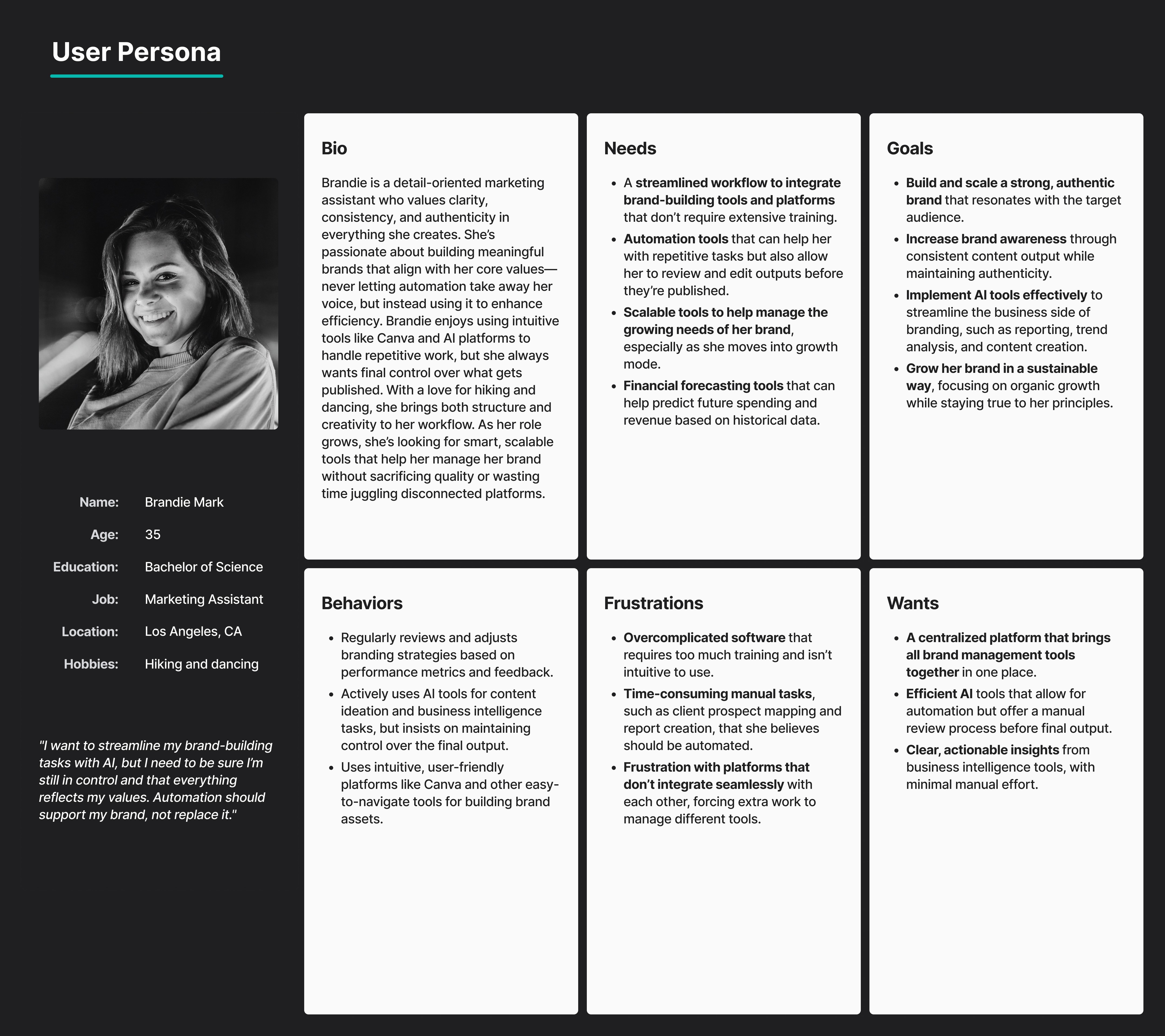
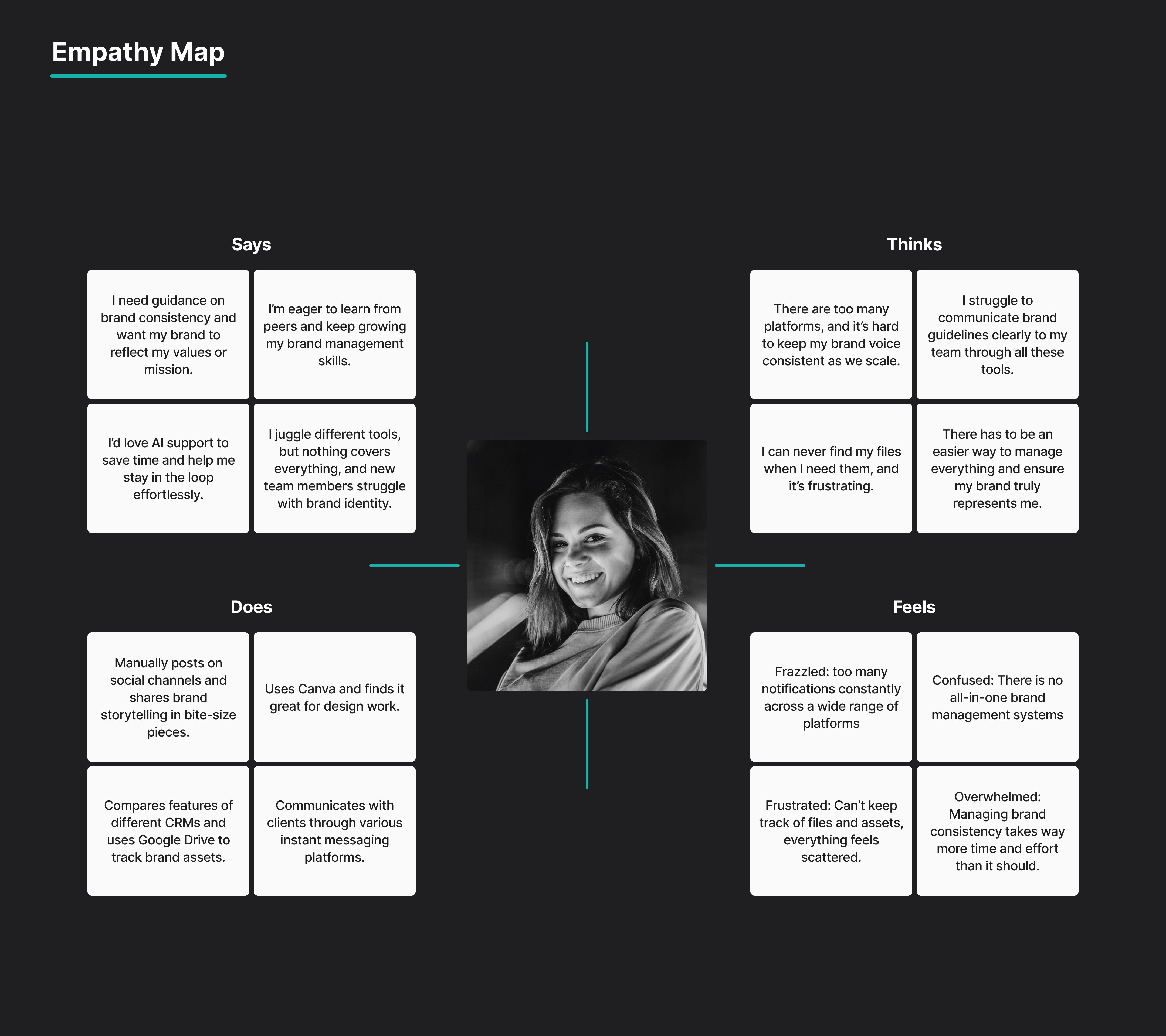
We interviewed users (brand owners and freelancers) and kept hearing the same struggles: too many tools, no clear roadmap, and wasting time trying to organize things manually. We created an affinity map to group the insights and built personas like “Brandie,” who was overwhelmed and needed AI help but still wanted control. After mapping out the sitemap and brainstorming “How Might We” questions, we did a lot of paper sketches to get our first ideas out fast. We used dot voting to figure out which ideas made the most sense before turning them into mid-fi wireframes in Figma.


Problem Statement
Brandie needs a centralized and intuitive platform so that she can efficiently scale her brand while maintaining authenticity.


Turning Feedback Into Focus
What Users Told Us
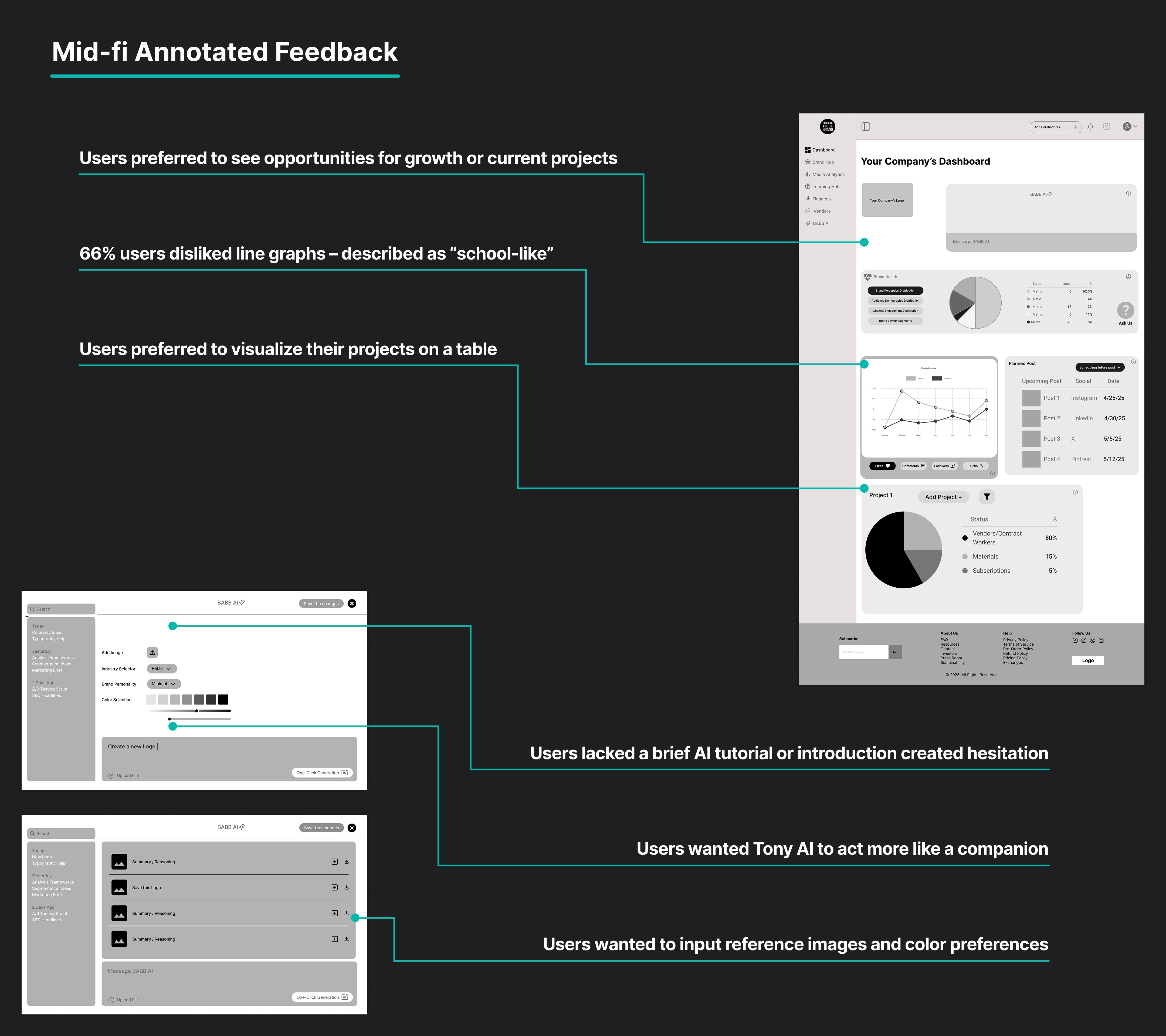
When we tested our early designs, users gave us clear feedback: some things worked, but other things confused them. They wanted simpler visuals, clearer onboarding, and easier ways to track their brand performance.
The Big Changes We Made
Mid-fidelity usability testing showed us some big problems: users really didn’t like the line graphs. They also needed better onboarding to understand how Tony AI worked, and they wanted to see their campaigns right away without digging around. So, we made some key changes: we switched to bar charts, added hover tooltips, built an onboarding pop-up for Tony AI, and simplified the dashboard to highlight what users cared about most. It was a big step toward making things feel smooth and simple.

Bringing It to Life in High-Fidelity
After the mid-fidelity testing helped us identify what needed to change, we moved into designing the high-fidelity prototype. This stage was all about bringing clarity, consistency, and personality into the product.


I started by creating a simple style guide. I chose a clean, modern typeface to improve readability and a soft, brand-friendly color palette that made the platform feel professional but not overwhelming. I also added thoughtful touches like iconography and consistent spacing to make the interface feel more intuitive.
I redesigned key screens like the dashboard, Brand Hub, and Tony AI to reflect the updated flow and make the visuals more engaging. At the same time, I made sure that the UI stayed simple and didn’t overload users with too many elements.
Once the screens were finalized, I built a clickable high-fidelity prototype in Figma. It allowed users to fully interact with drag-and-drop features, open AI prompts, view charts, and explore real navigation. This version was what we used in our final round of usability testing.

From Prototype to Proof
Testing the Final Design
After making changes, we ran high-fidelity usability tests to make sure everything worked. The results were super positive: users found it easy to navigate, AI was clearer, and drag-and-drop features worked well.
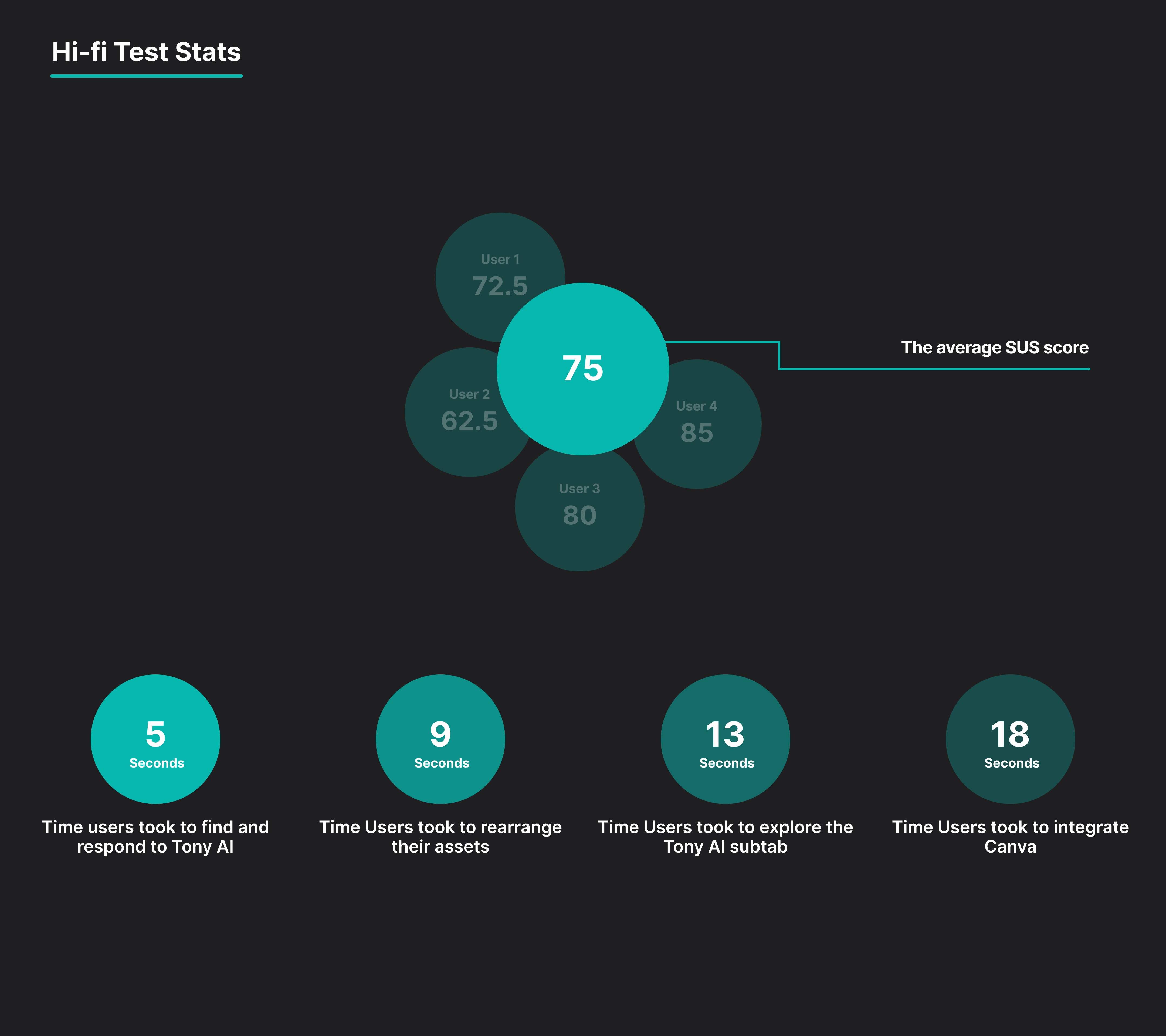
Results & What Worked Well
We tested the high-fidelity prototype with 4 users. The feedback was great: 100% task success, an average of 15-20 seconds to complete key tasks, and a SUS score of 75 (good usability). Users said the dashboard felt clean, the AI made sense, and drag-and-drop worked as expected. We also got helpful notes on what to improve next, like expanding AI prompts and making integrations even smoother. Stakeholders were happy with the progress and liked how scalable the design felt for future updates.
Designing Confidence, Not Just Software
The Impact
In the end, we delivered more than a design — we created a platform that gives users confidence. Now they can manage their brand with clarity, all in one place, and trust that AI is there to help, not control.
What I Learned & The Big Takeaways
This project really taught me the power of testing and iterating. It showed me that it’s not about packing in tons of features but about making sure the features you do have actually help users in a clear and simple way. It also showed how important it is to balance business goals with real user needs. Seeing users go from confused to confident during testing was the best part. We ended with a design that users and stakeholders were excited about, and I learned a ton as a designer.

