Where Passion Meets Frustration
DIYers Were Dreaming Big, But Falling Short
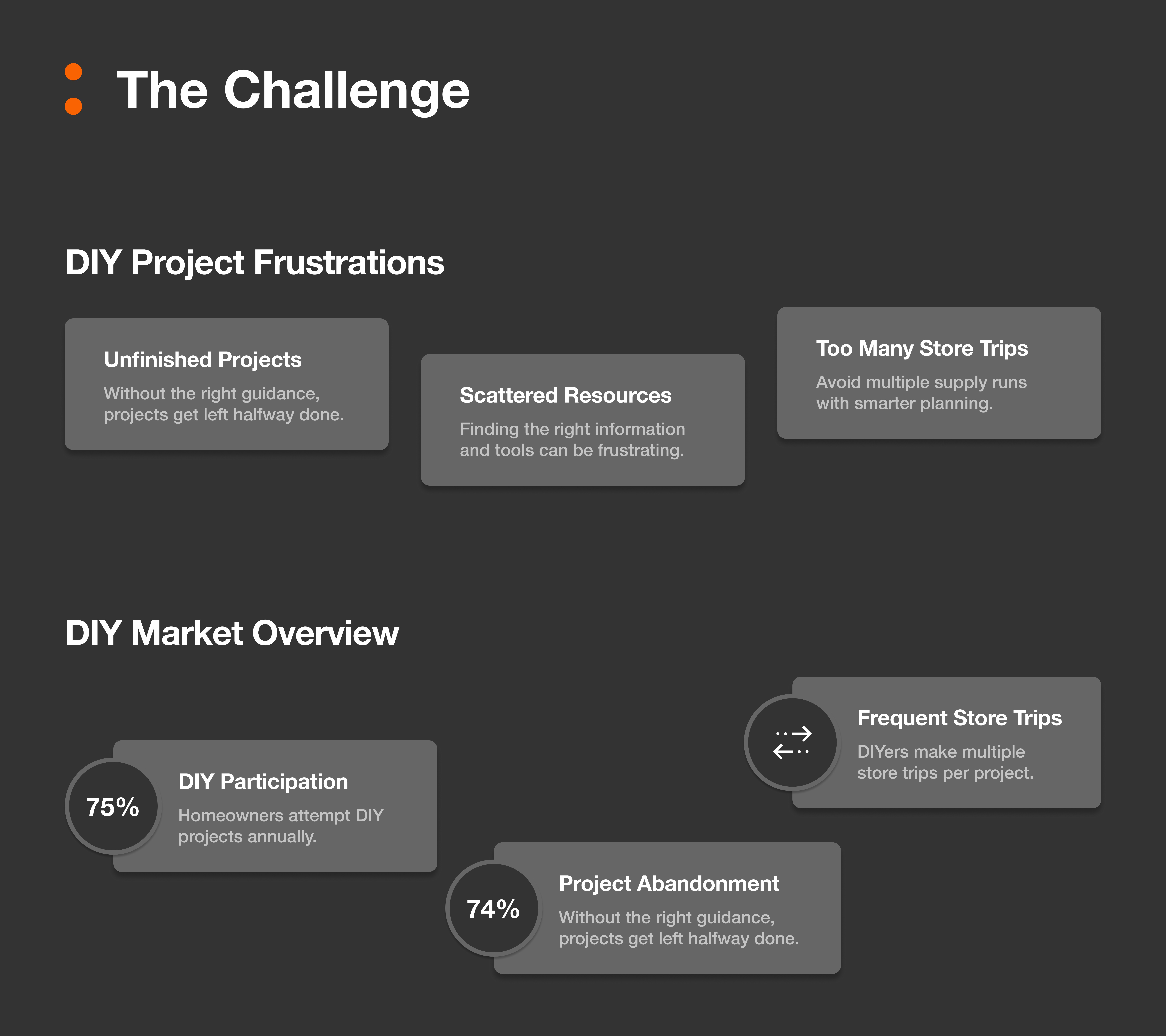
Many DIYers start with passion—but lose steam when planning, finding materials, or organizing next steps becomes too messy.
Why We Chose to Build a Smarter DIY Companion
As part of a UX design bootcamp at General Assembly, our team was tasked with extending the Home Depot app to better support DIYers. We quickly discovered a core problem: while users were excited to build and create, they were often overwhelmed when it came to tracking materials, planning their steps, and avoiding repeat trips to the store. Nearly 74% of DIY projects are abandoned mid-way, often due to confusion or lack of planning. That number stuck with us. We knew we had to design a tool that helped people move from “I want to build this” to “I actually finished it.”
Turning Voices Into Insights
We Talked to DIYers and Mapped Their Needs
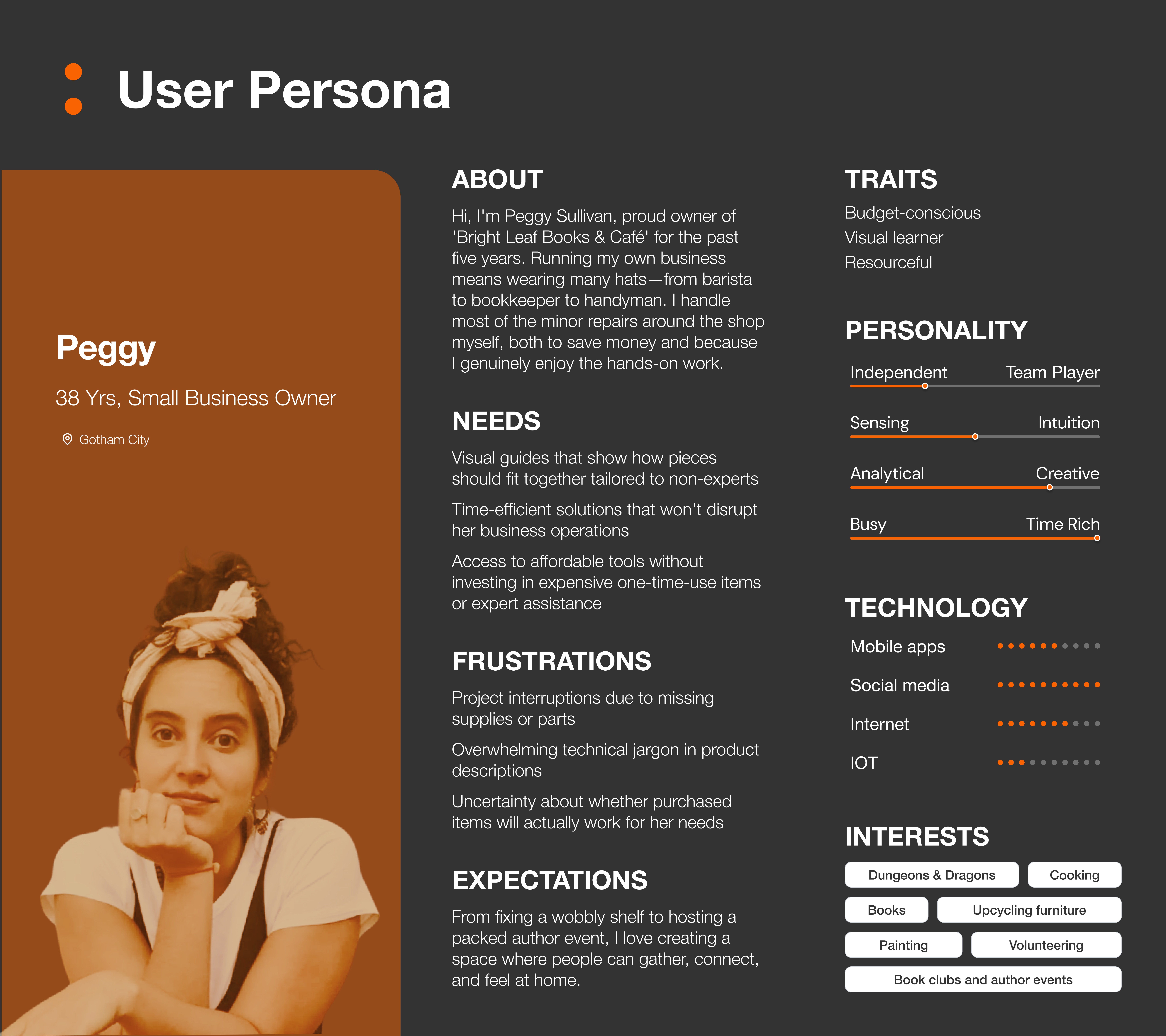
We conducted interviews, competitive analysis, and affinity mapping to uncover pain points and shape our direction.
From Conversations to Concepts
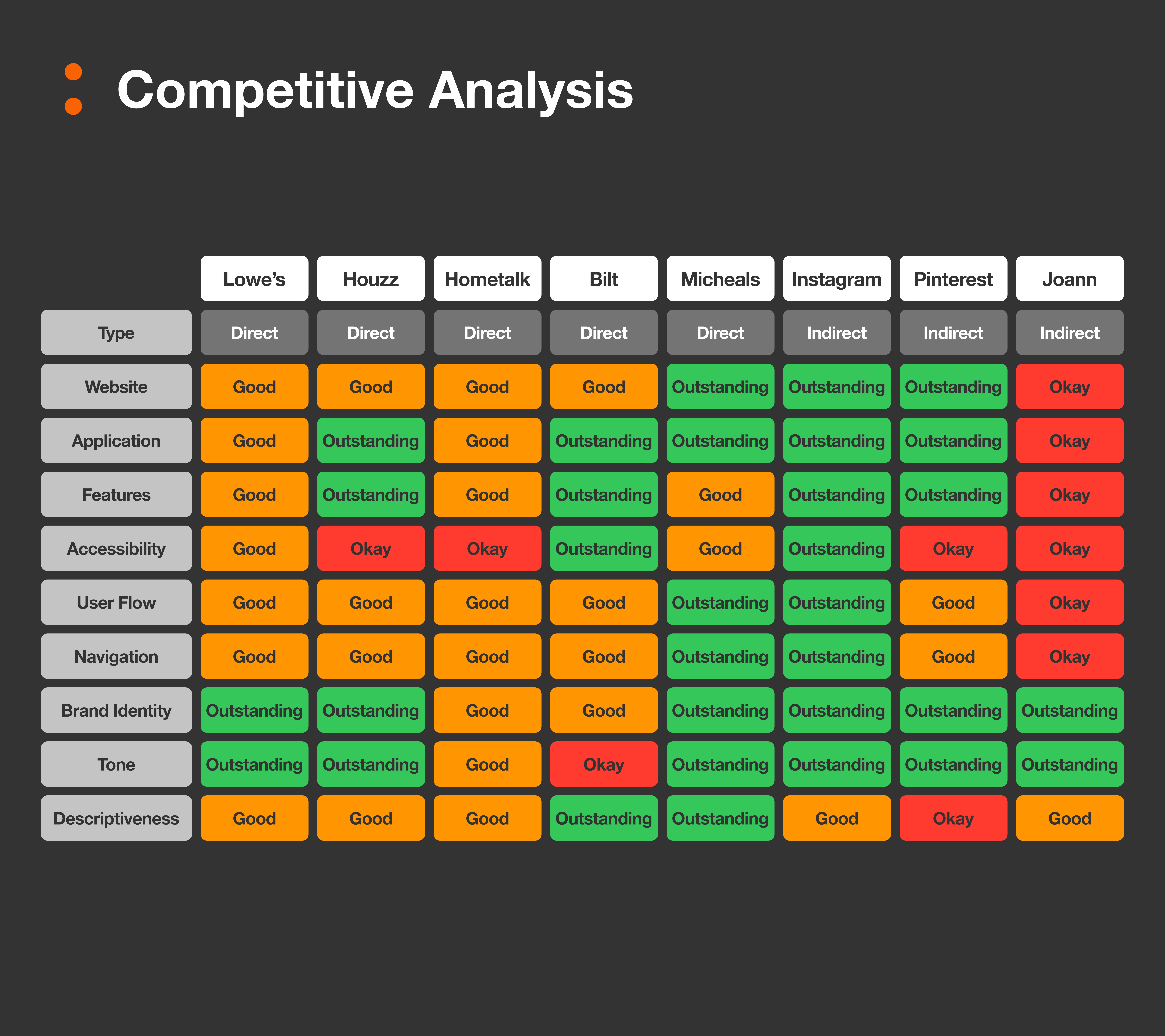
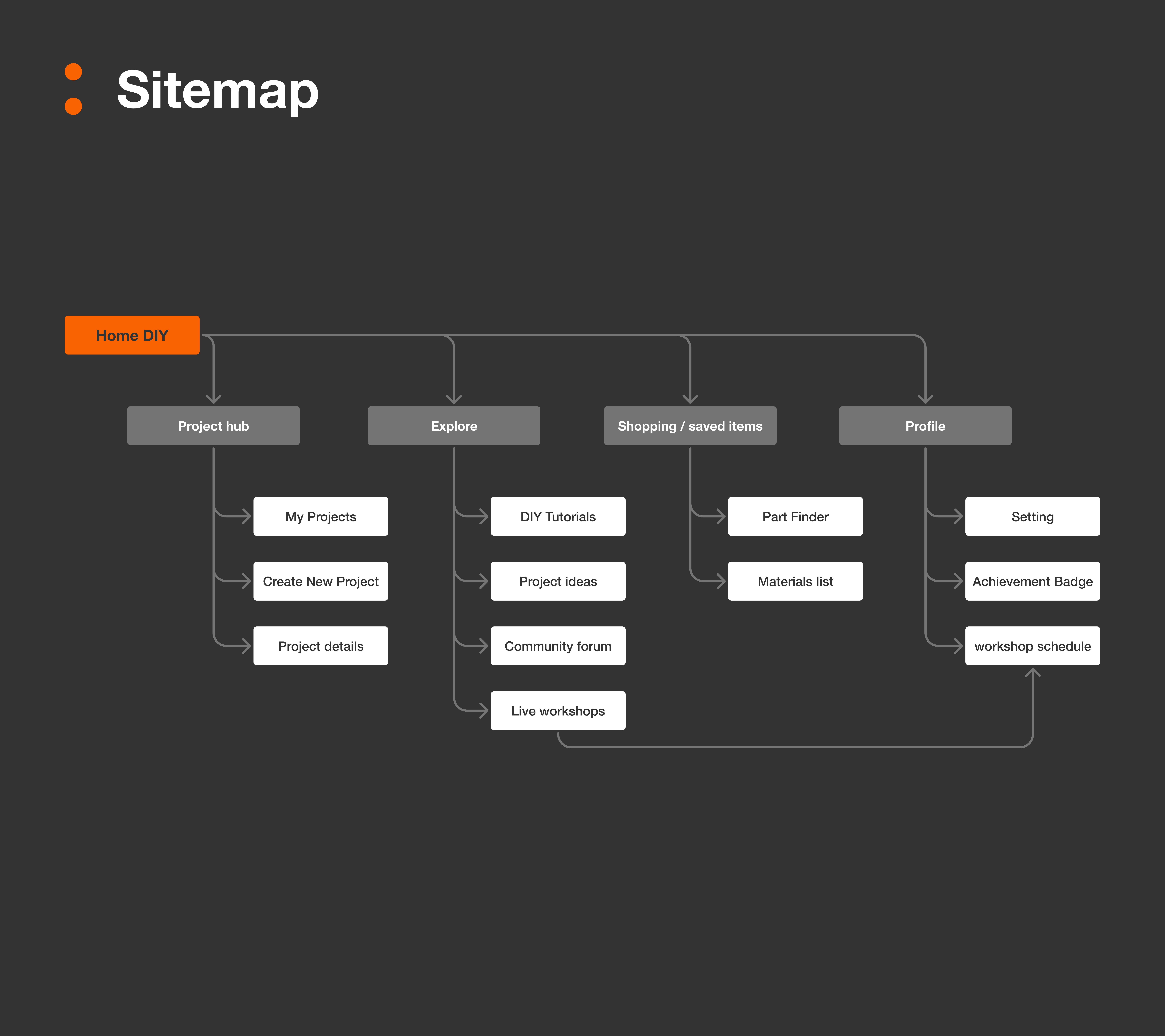
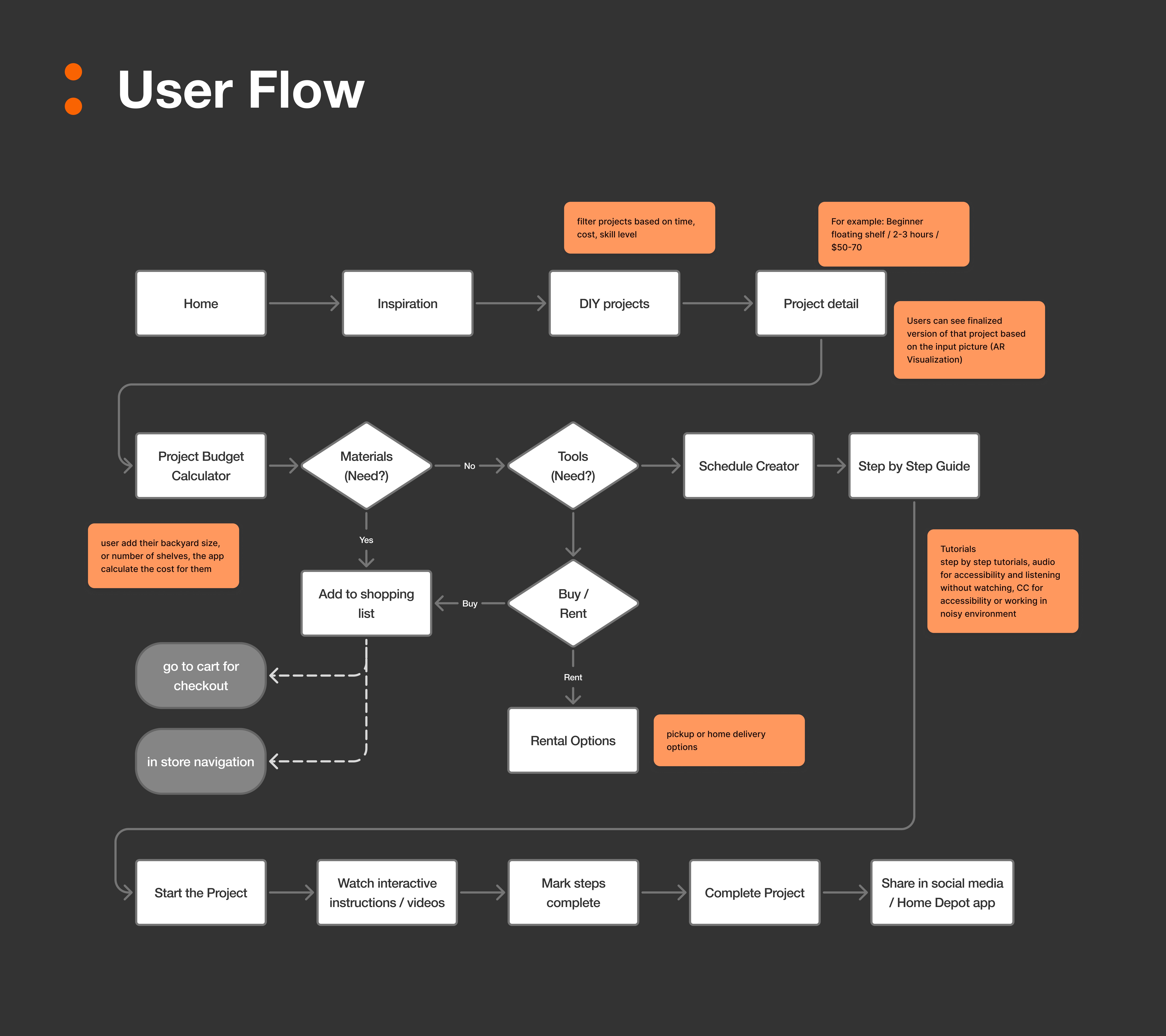
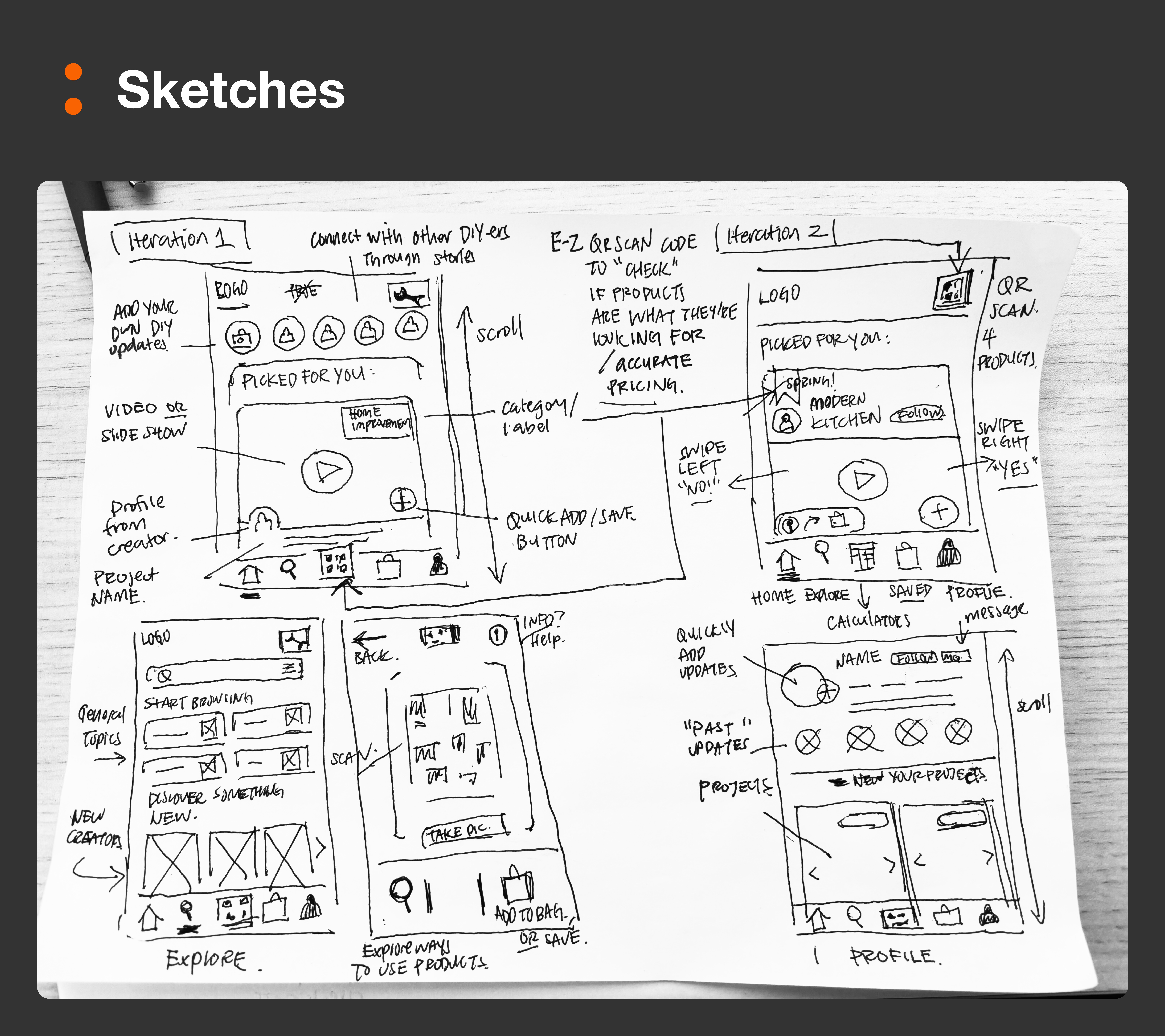
We interviewed 5 diverse DIYers—from hobbyists to seasoned makers. Their stories pointed to the same friction: scattered info, disorganized workflows, and uncertainty about what to do next. Using affinity mapping and “How Might We” questions, we pulled out actionable insights. We also ran a competitive analysis of 6 tools, including Lowe’s, Houzz, and Pinterest, which showed that while these apps had strong individual features, none brought everything together in one smooth experience. These findings helped us define a focused set of features: live inventory tracking, photo-based material planning, in-app tutorials, and a project timeline.
Problem Statement
DIY Enthusiasts need an efficient way to
plan and track their DIY projects so that they can challenge themselves in their creative endeavors.
Where Feedback Changed Everything
Our Mid-Fi Prototype Met Real Users
Our first round of testing revealed exactly where users got stuck—and what needed to change before we could move forward.
What We Learned (and Fixed)
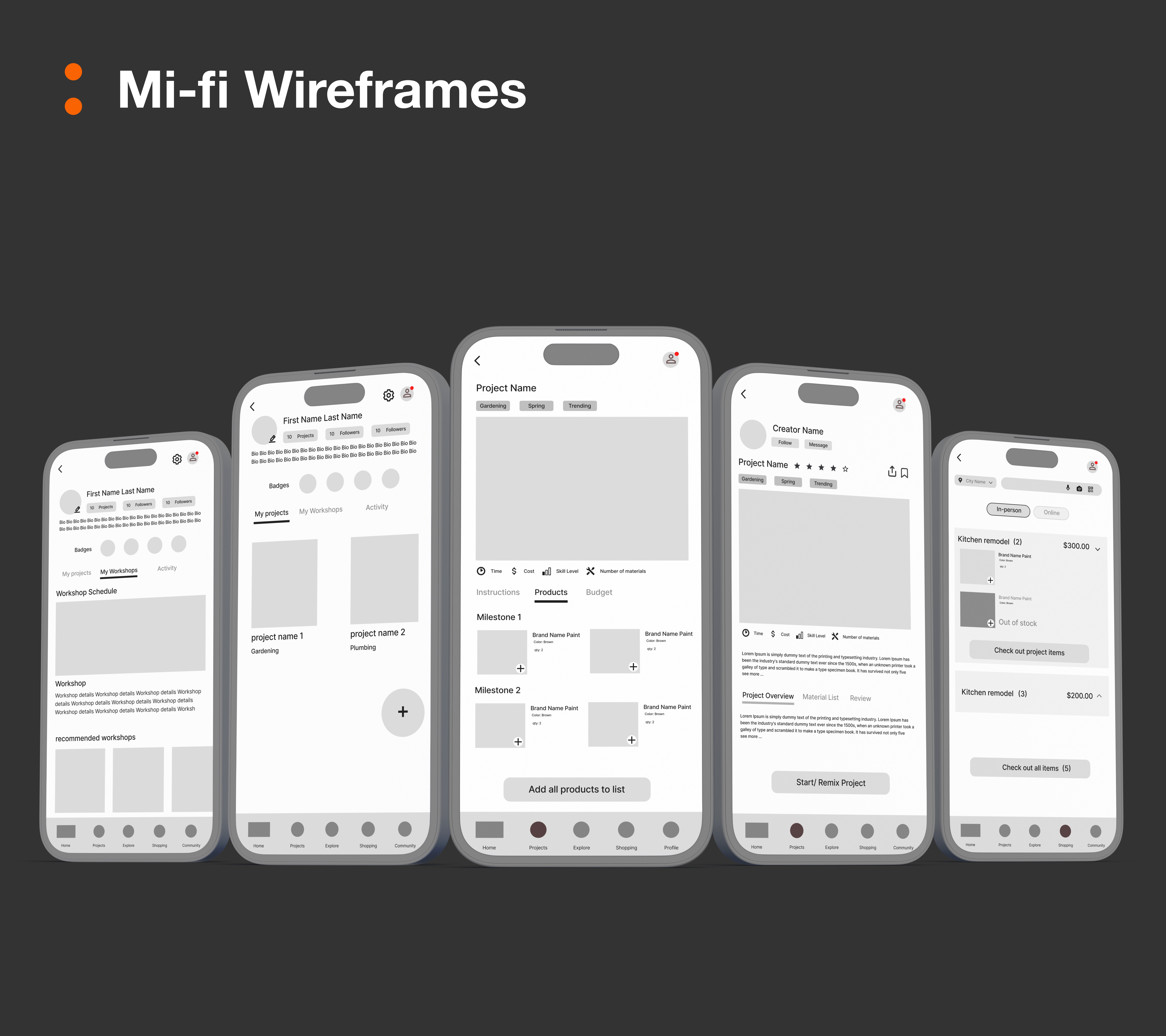
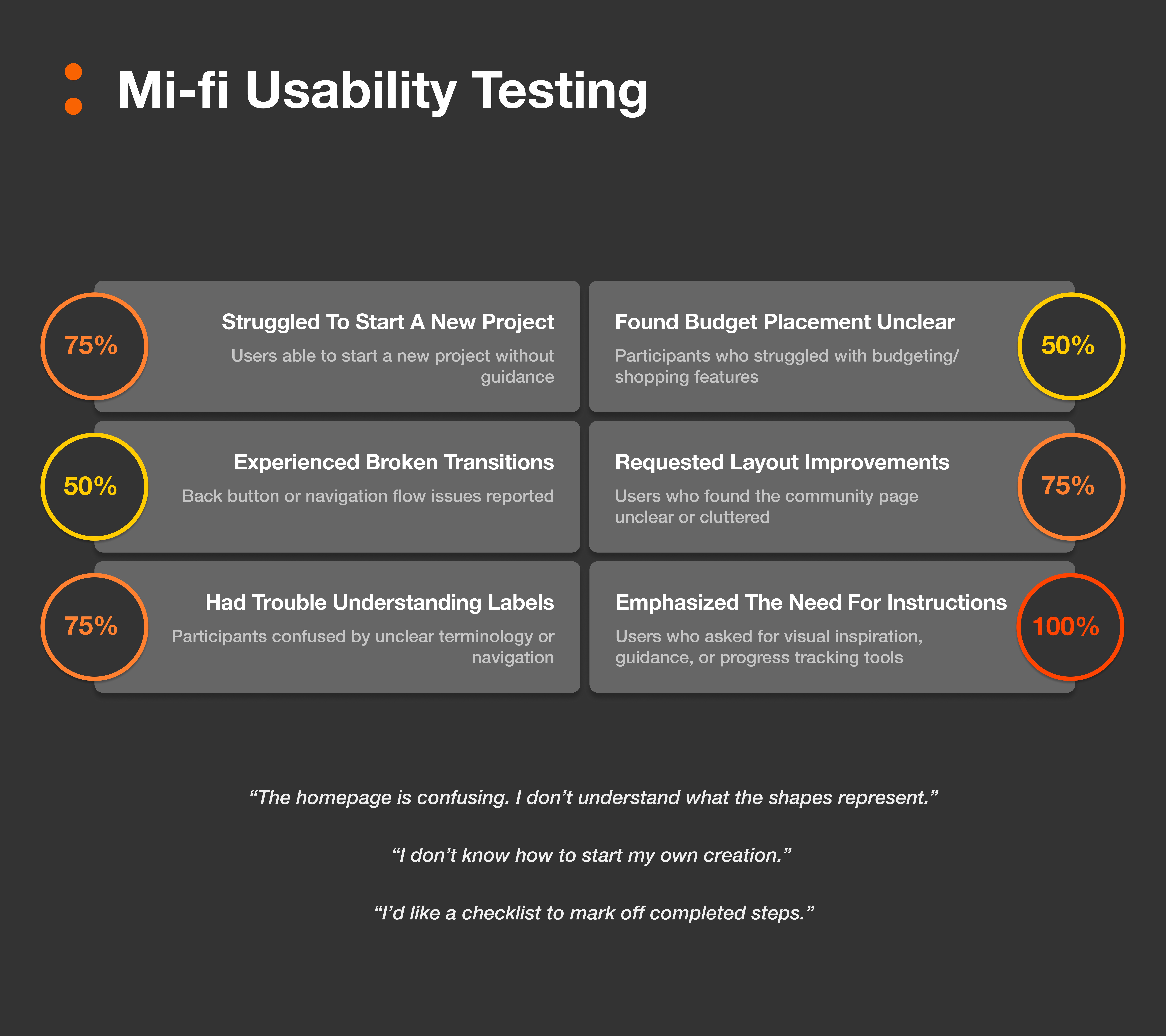
We tested our mid-fidelity prototype with 4 remote users using moderated sessions. Right away, we noticed key usability breakdowns:
75% struggled with unclear navigation or confusing terms like “Milestones” or “FYP”
Only 25% found the flow smooth without guidance
50% were confused by the shopping/budget tools
And 100% wanted more visual inspiration and progress tracking
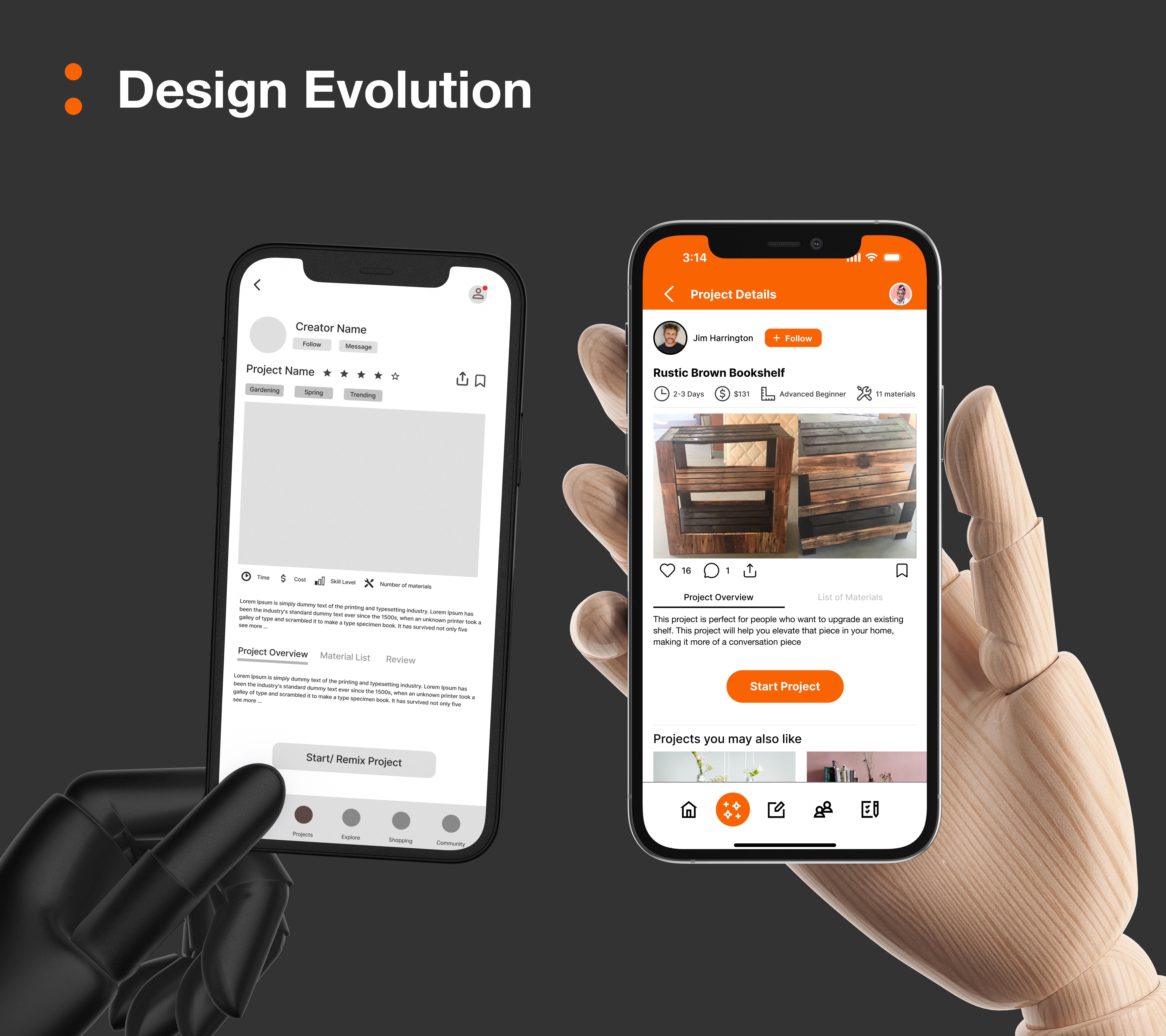
Most users expected visual cues, simpler copy, or clearer page transitions—50% even reported broken or unclear flows with the back button. Only half said they’d use the app again in its current form. These insights helped us clarify terms, redesign navigation, and clean up task flows for better guidance and less confusion. It wasn’t just helpful—it was essential.
Bringing the Blueprint to Life
Hi-Fi Designs That Simplified the Chaos
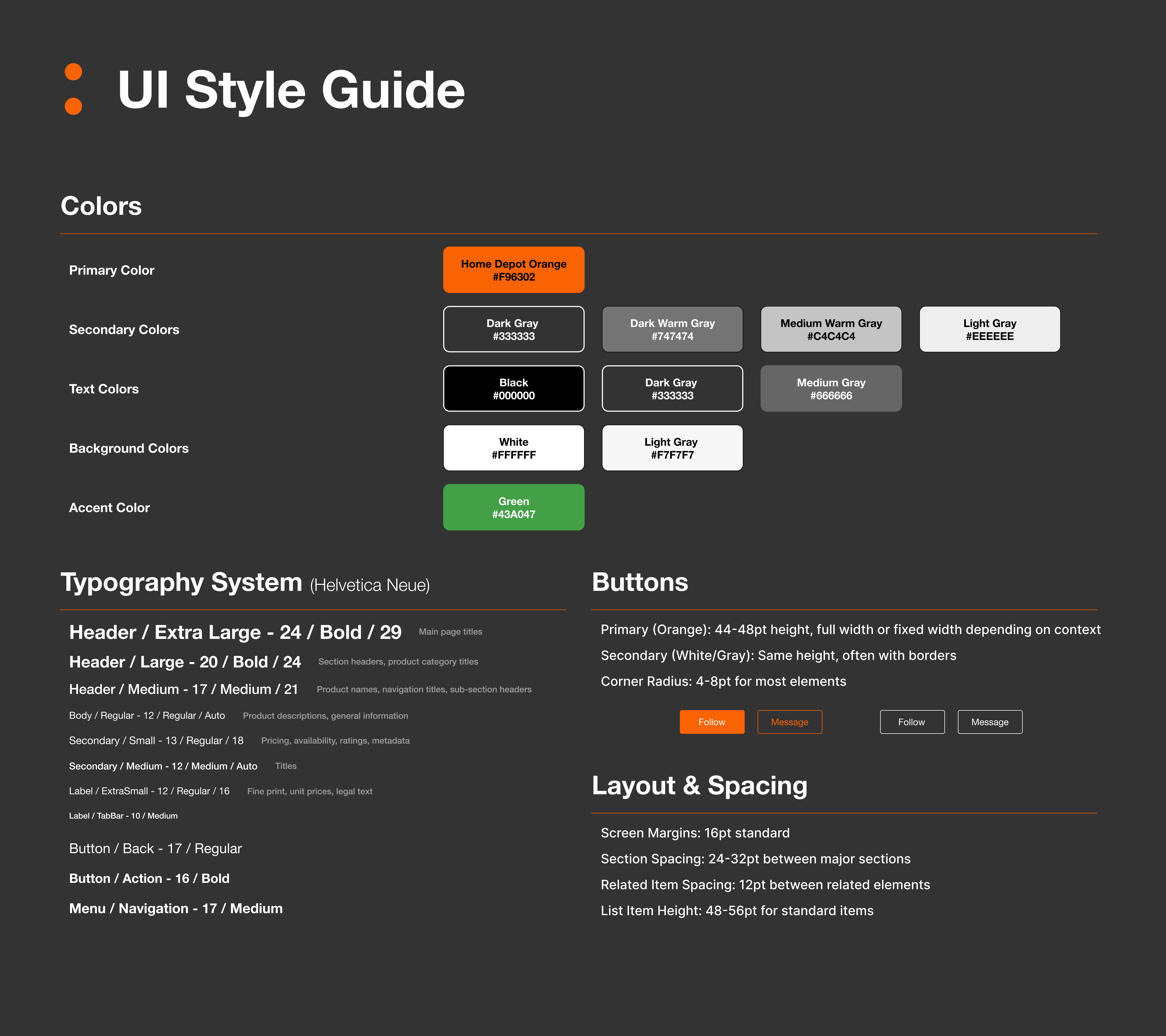
We built a high-fidelity prototype using a refined style guide, and made big UX improvements based on testing.
From Sketch to System
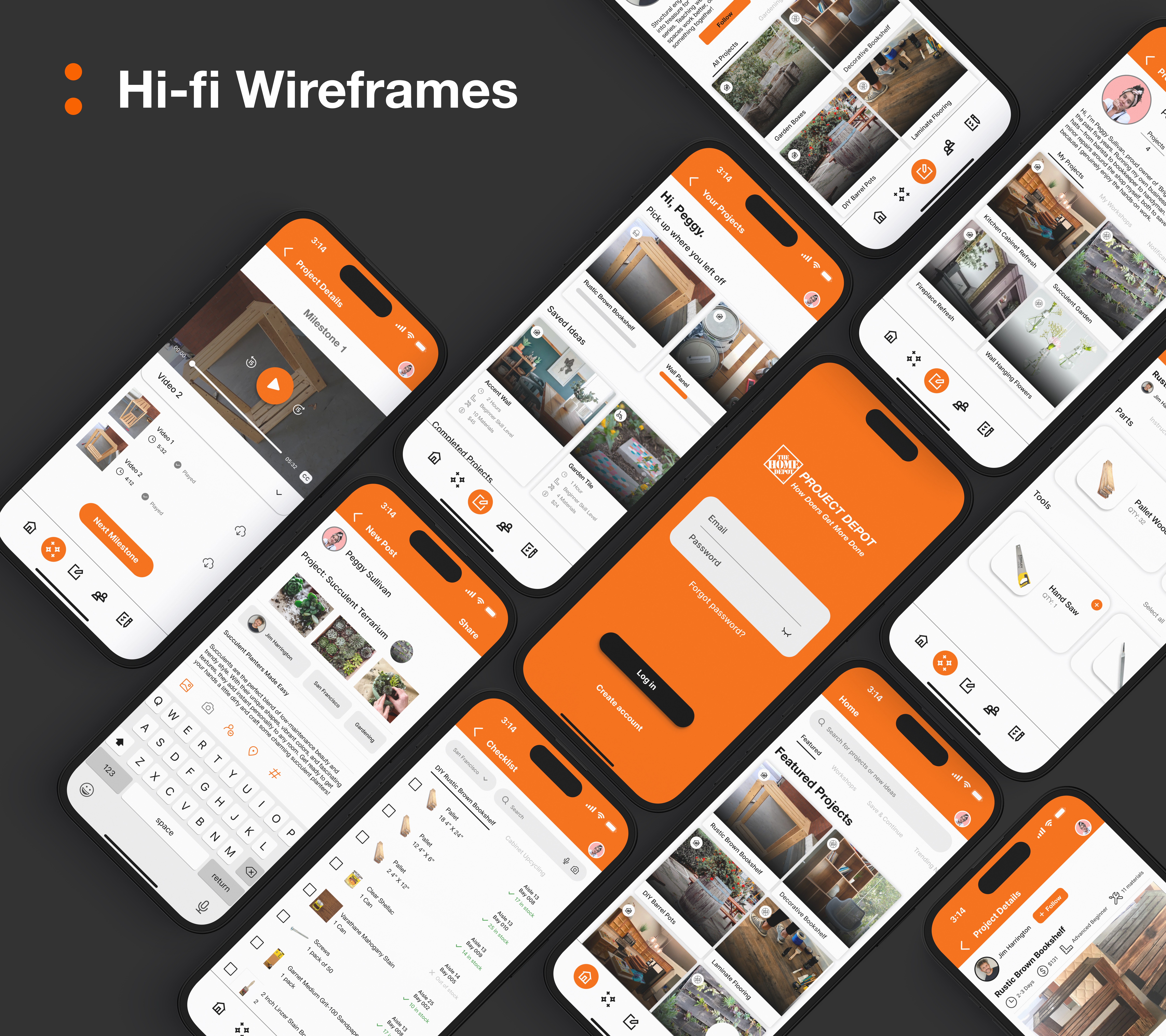
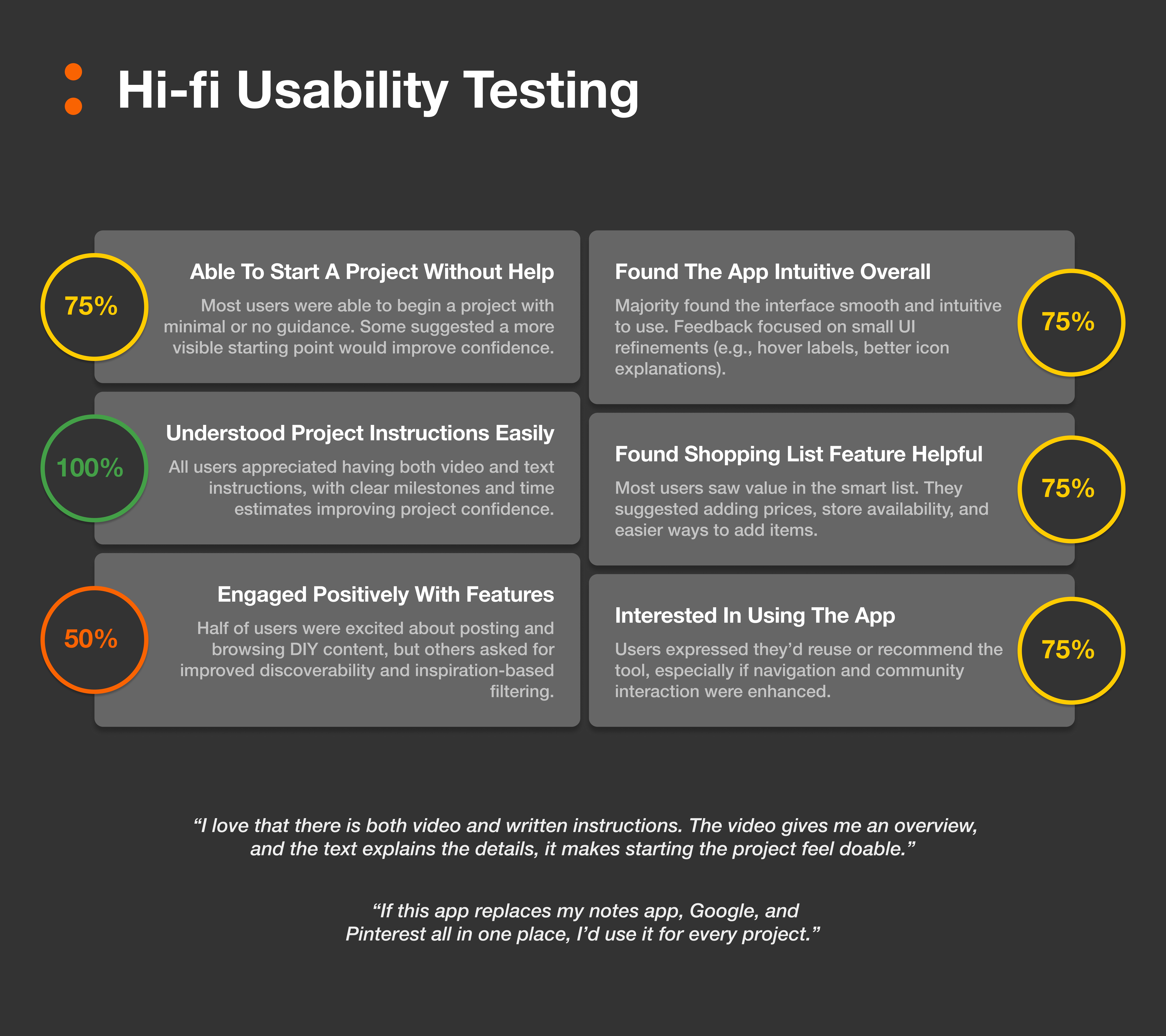
With clear goals in place, we built a full high-fidelity prototype. Our style guide kept everything consistent—clean typefaces, calm color palette, and intuitive layouts. We redesigned the shopping list to reflect live inventory and in-store aisle locations, introduced milestone-based project timelines, and connected the experience with an in-app community. This time, 80% of users completed tasks more efficiently and found the flow easier to follow. We also created a visual system to guide users from start to finish with minimal guesswork.
Confidence, One Project at a Time
A Tool for Makers, by Makers
The final product made DIY feel less daunting and more doable. We didn’t just design an app—we designed confidence.
What We Delivered — and What We’d Explore Next
Project Depot became more than a class project—it became a real solution for real users. By bringing together materials, planning tools, and tutorials, we helped people move from scattered ideas to finished projects. We saw higher task success rates, smoother flows, and more user delight. If we had more time, we’d explore augmented reality for project walkthroughs, personalized tool suggestions, and even voice-controlled guidance.
Looking Back—and Looking Forward
What We Learned and What’s Next
The project challenged us, taught us, and shaped how we approach design—together and individually.
As a team, we walked away with much more than a working prototype. I gained a deeper understanding of the DIY community—what they value, what trips them up, and what they need to feel confident. I learned to balance ambition with usability, creativity with clarity. Most importantly, I saw how iterative testing turns assumptions into insights.
Reflections, Growth, and Future Possibilities
Structural Integrity – What We Took Away:
Gained real insights into the needs of DIYers
Learned how to prioritize features without overwhelming users
Created strategies for integrating new tools into existing ecosystems like Home Depot’s app
Grew as a team, refining our collaborative design process
Learned the power of clear, structured, repeated testing
Next Steps and Opportunities
We’re proud of where we landed—but there’s plenty of room to grow.
Here’s what we’d love to build next:
Improved User Flows — more intuitive transitions and fewer dead ends
Feature Enhancements — including more responsive layouts and tooltips


