
Why Buying a Ticket Feels So Hard
Frustration at the Box Office
Too many ticketing sites were confusing, cluttered, and slow. Users just wanted to book a seat—without the stress.
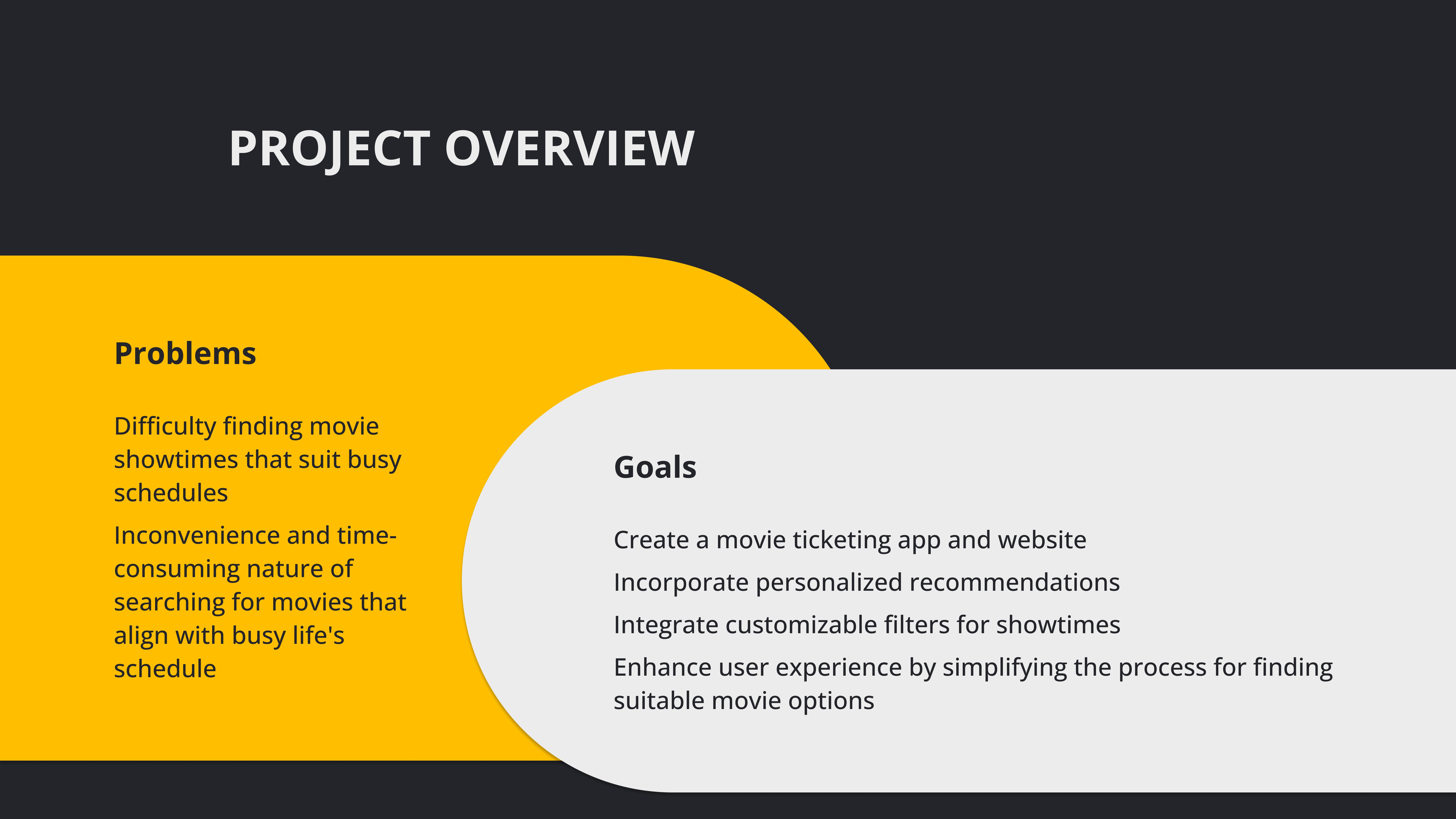
Buying movie tickets online should be quick and easy. But most sites made it feel like a chore. From bad mobile layouts to overwhelming seat maps, users were left frustrated. I wanted to design a smoother way to browse, book, and go. Something clean, fast, and joyful to use—whether you’re on a phone or a laptop.
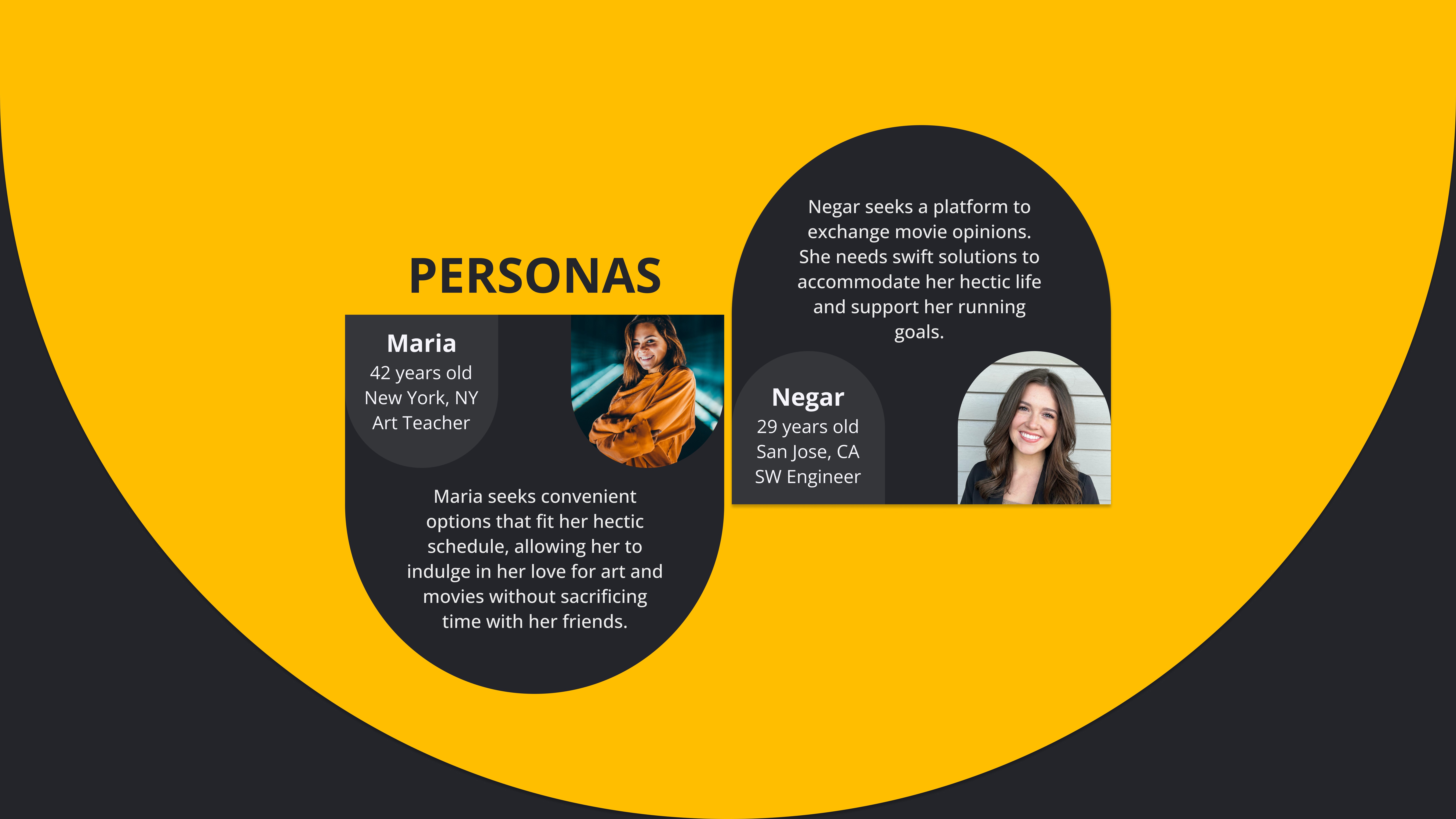
As a runner, I’ve heard this too often: “It’s just a little pain — I’ll shake it off.” But the truth is, most runners lack the right support when something feels off. They often turn to Google, forums, or guesswork. Through early exploration, I found a big gap: no tools that combine injury education, personalized recovery, and easy-to-use features in one place. Recovery Pal! was born from that need.
Understanding What Users Need
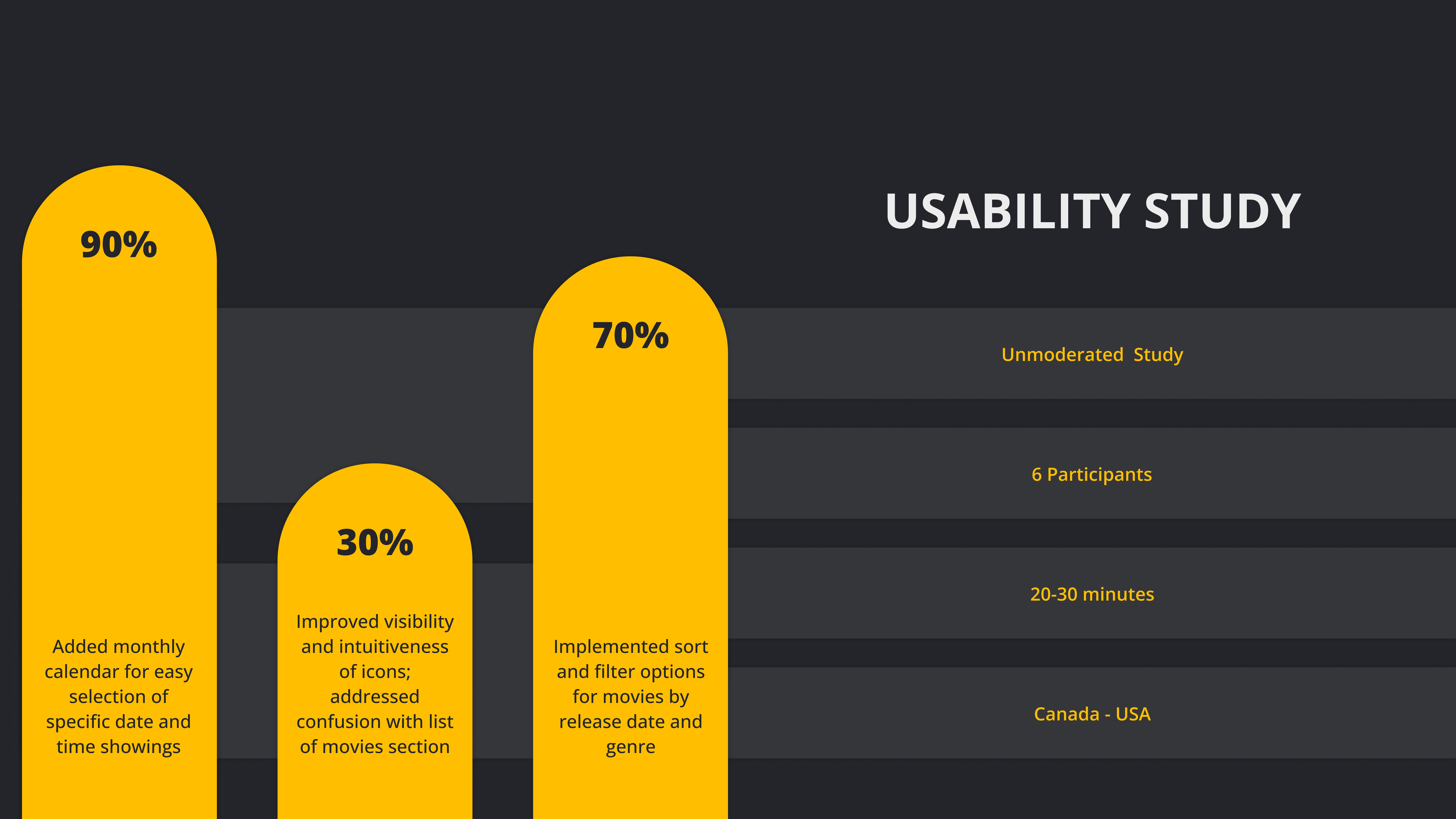
From Feedback to Flow
I asked real users what bothered them most. It wasn’t just design—it was the whole flow.
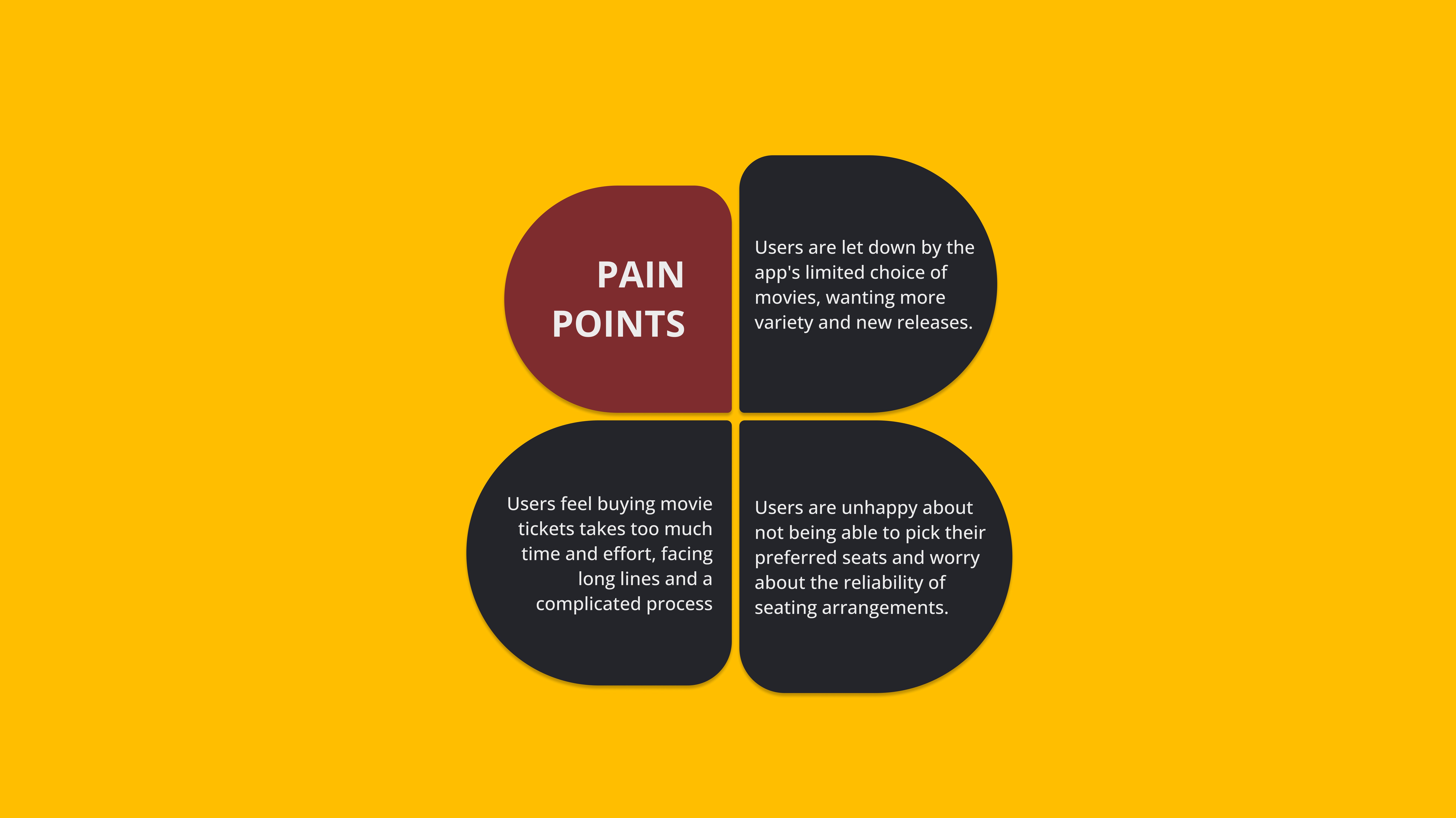
I interviewed 6 moviegoers and ran a usability test on a well-known ticketing site. Common complaints came up fast: slow load times, unclear seat maps, and complicated checkouts. Many users also said they felt rushed or confused by steps that weren’t clearly labeled.
So I mapped the journey, identified friction points, and looked for opportunities to improve the flow—from the first scroll to the final confirmation.
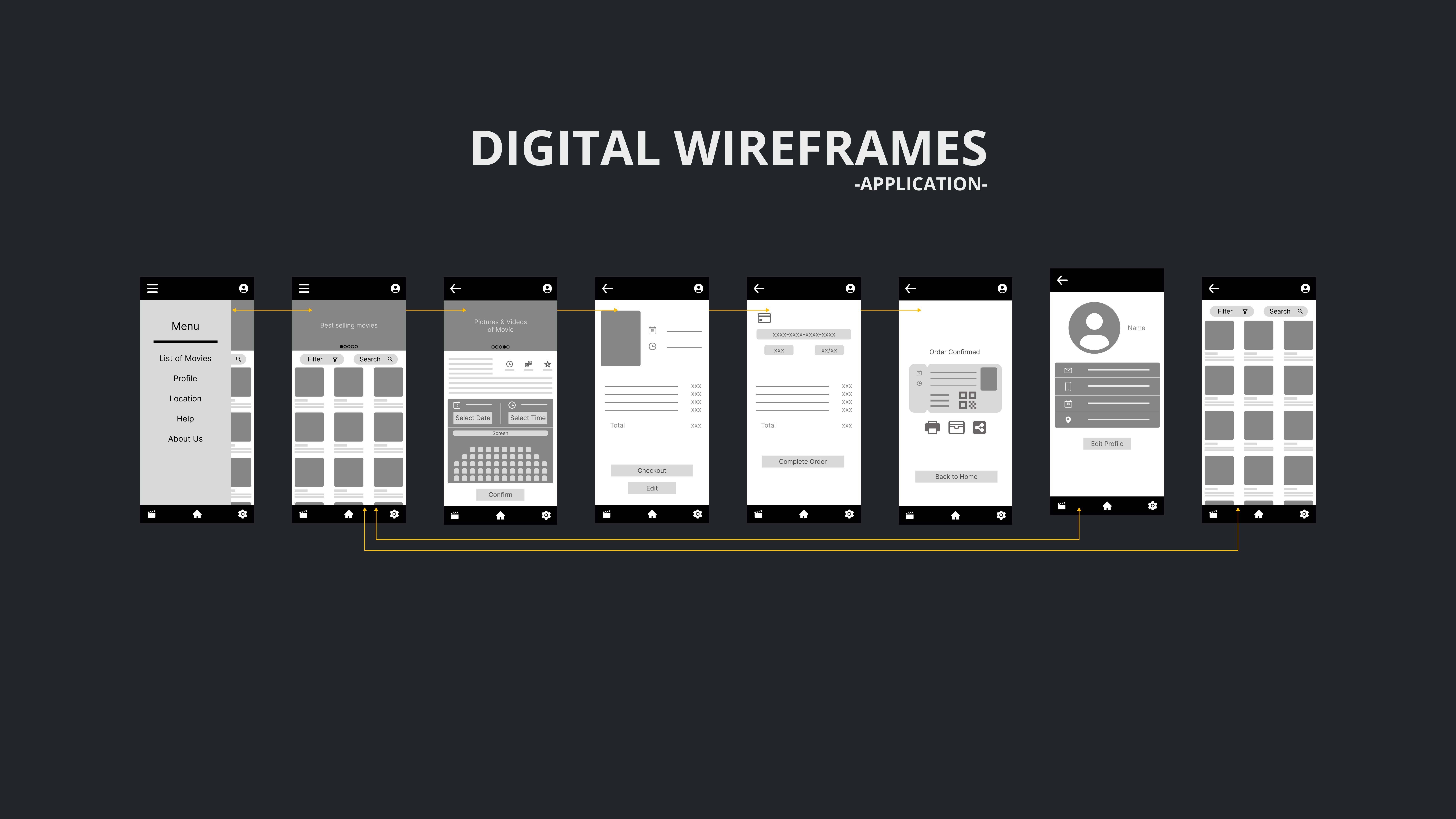
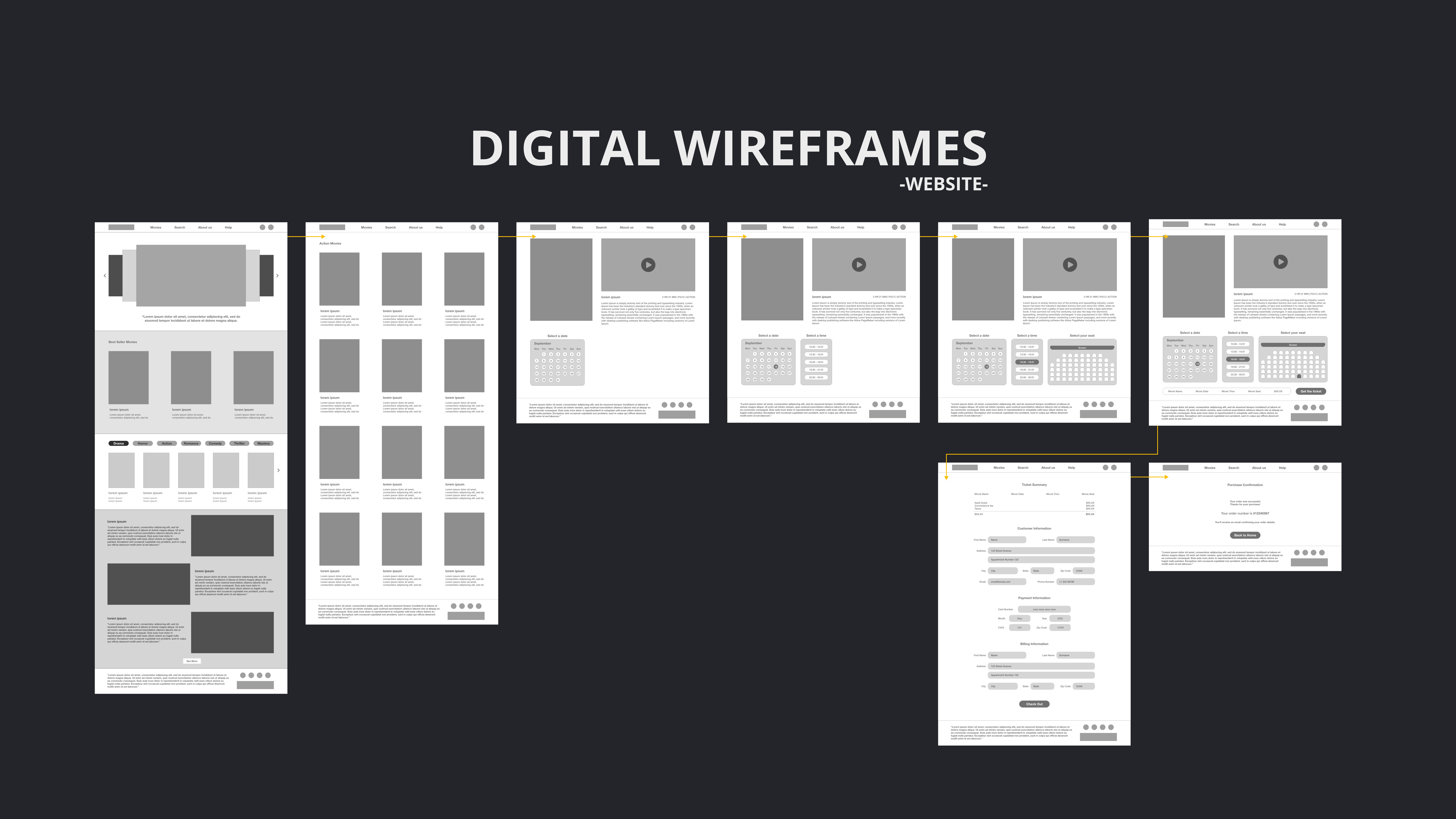
Redesigning the Experience
Clean, Simple, and Fast
My wireframes and early prototypes focused on clarity—clear steps, clean visuals, and smooth transitions.
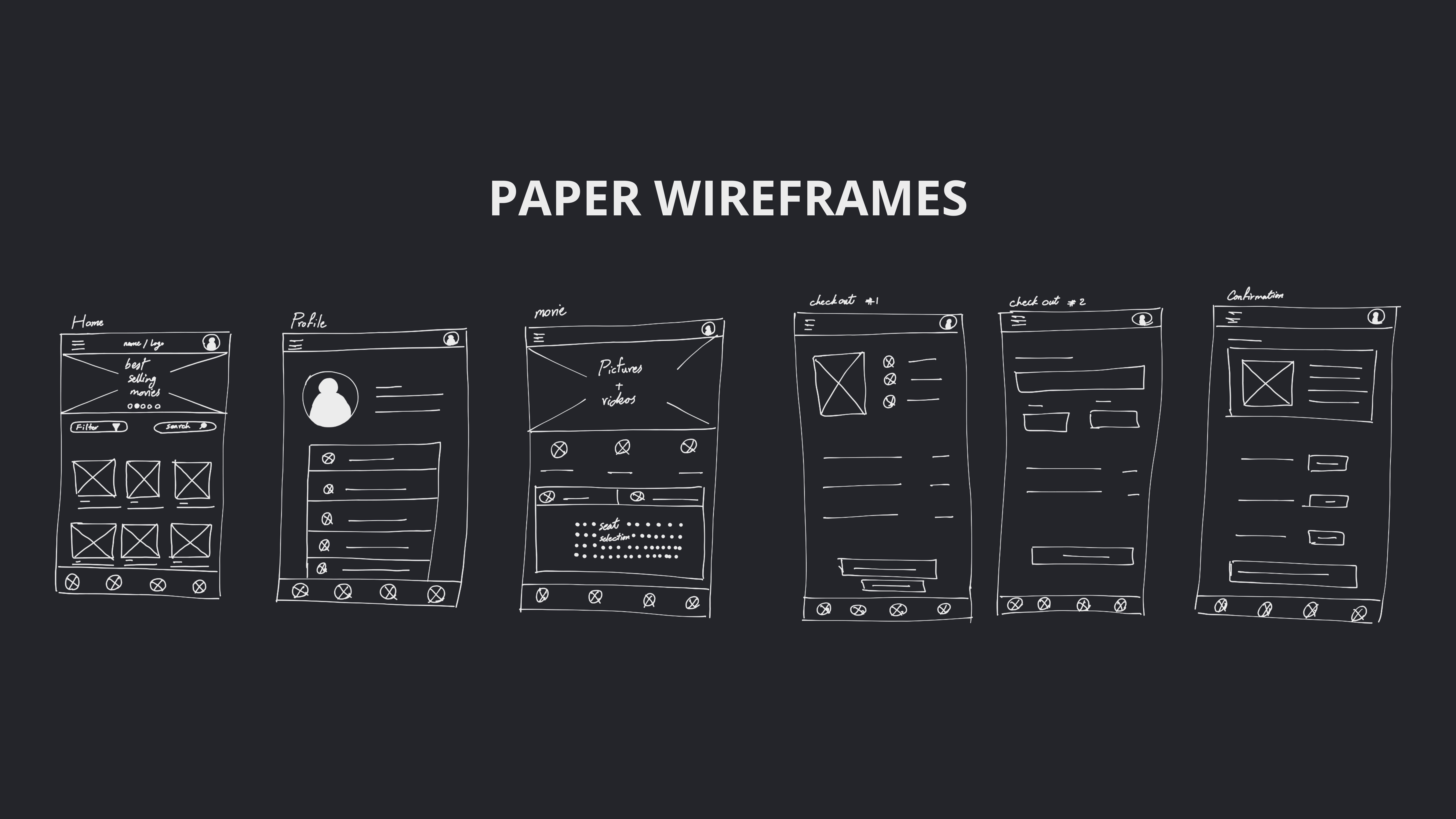
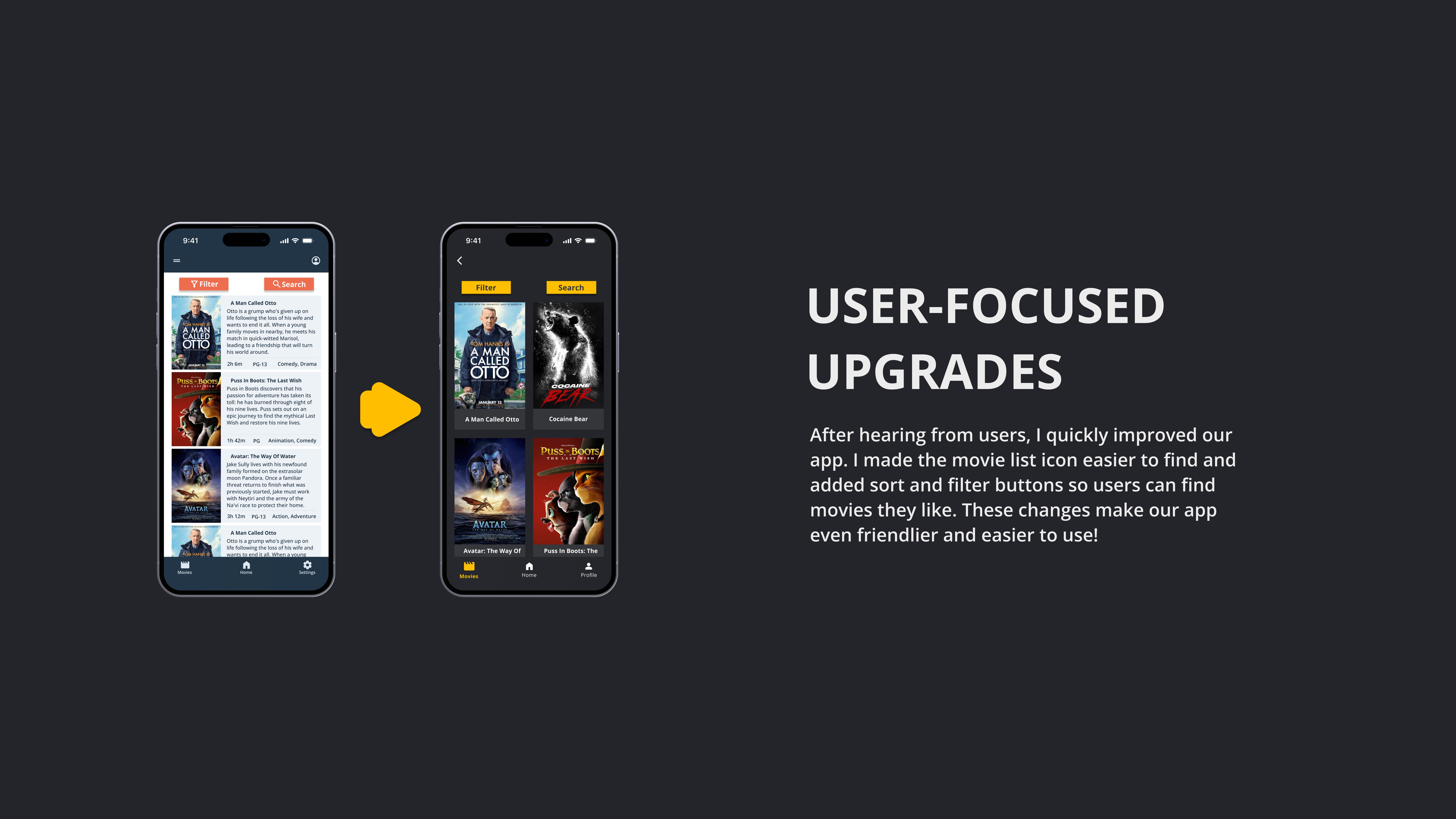
I sketched paper wireframes to brainstorm layouts for movie listings, showtimes, and seat selection. Then I moved to digital wireframes to test usability. I added progress indicators, big seat icons, and a mobile-friendly layout.
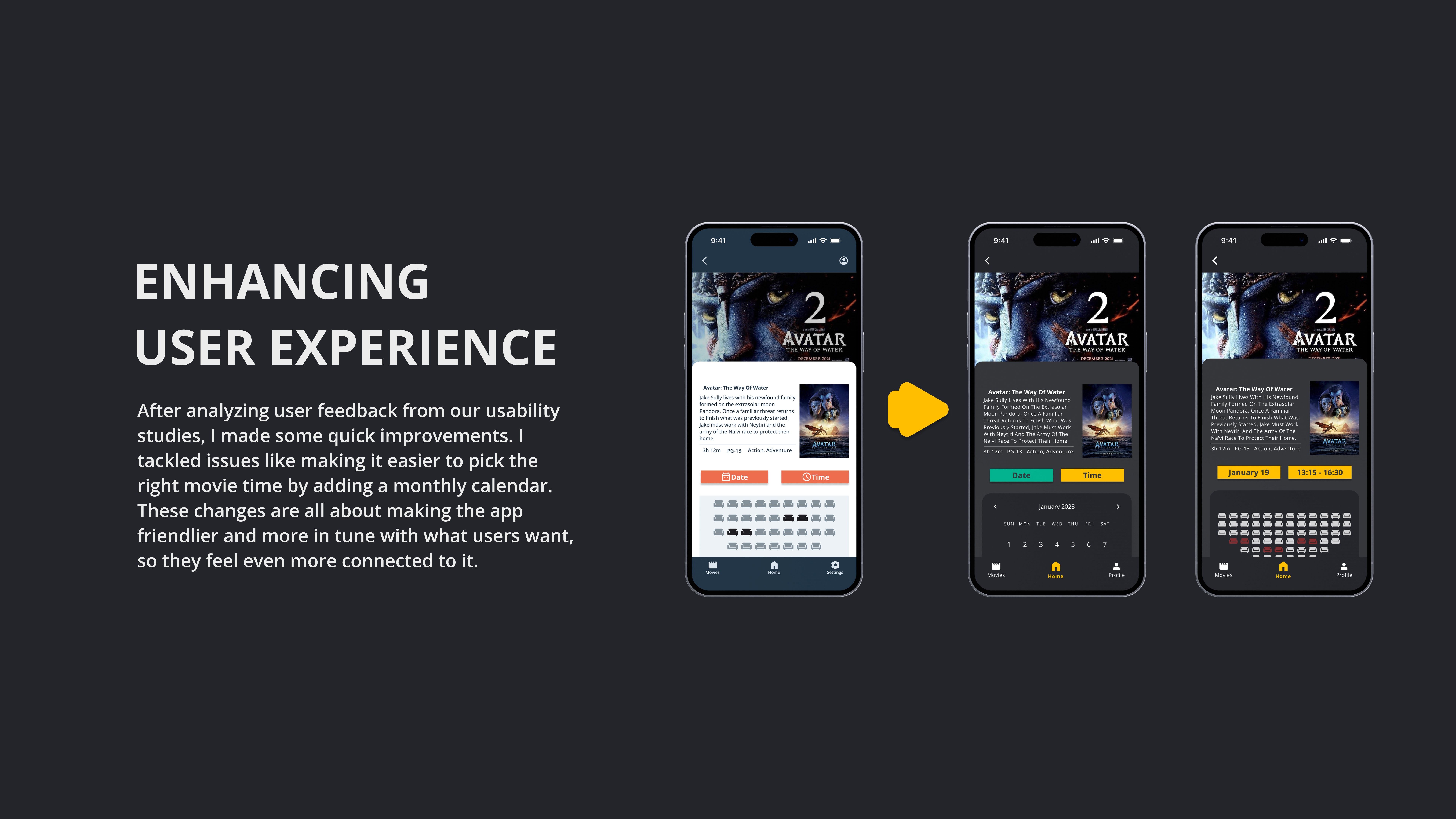
After the first usability study, I made updates based on real feedback. Users loved the clear seat map and fast flow but wanted better movie previews and trailer access. I added those and simplified the navigation.
Bringing the Final Design to Life
A UI That Feels Like a Friday Night
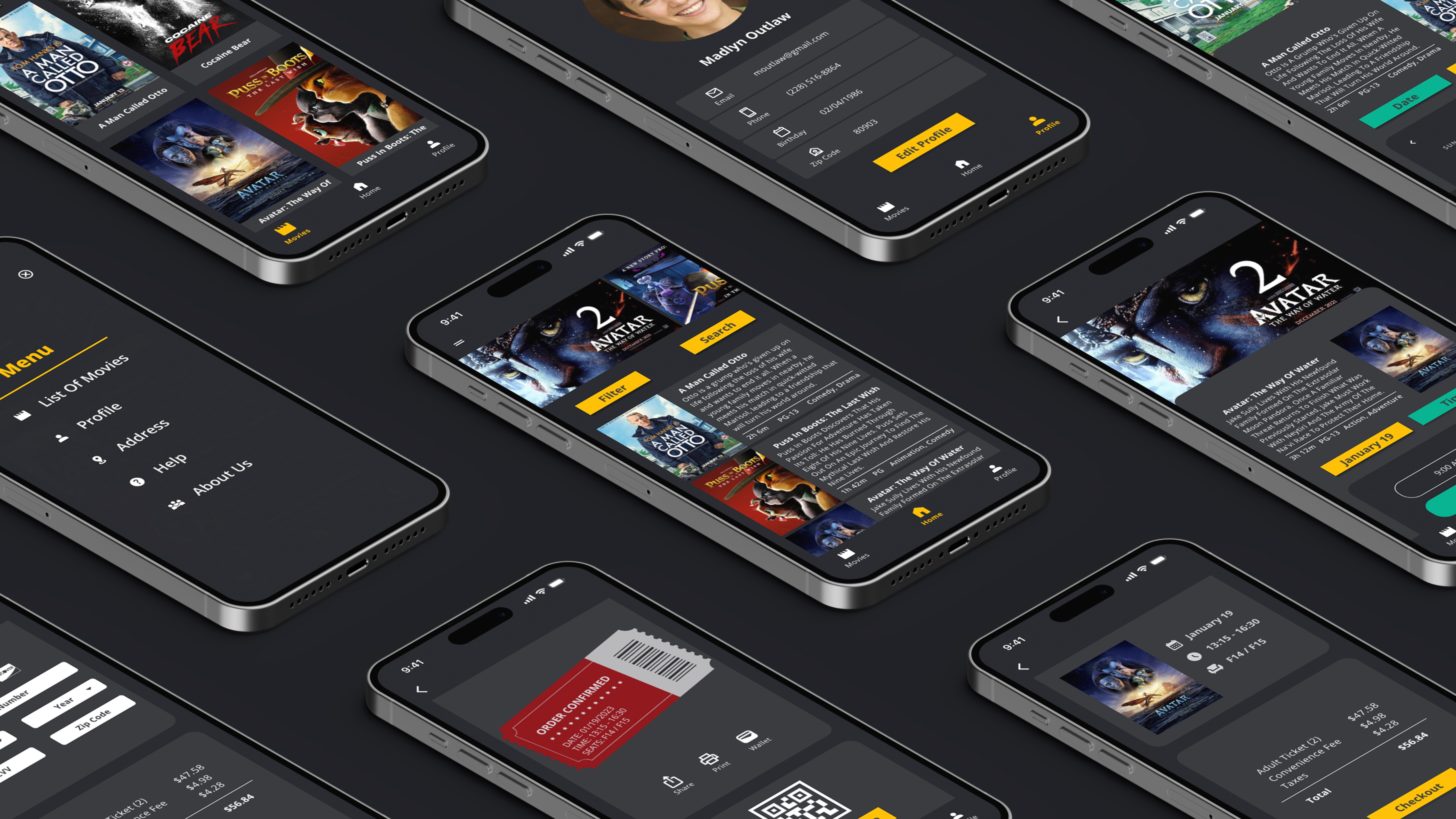
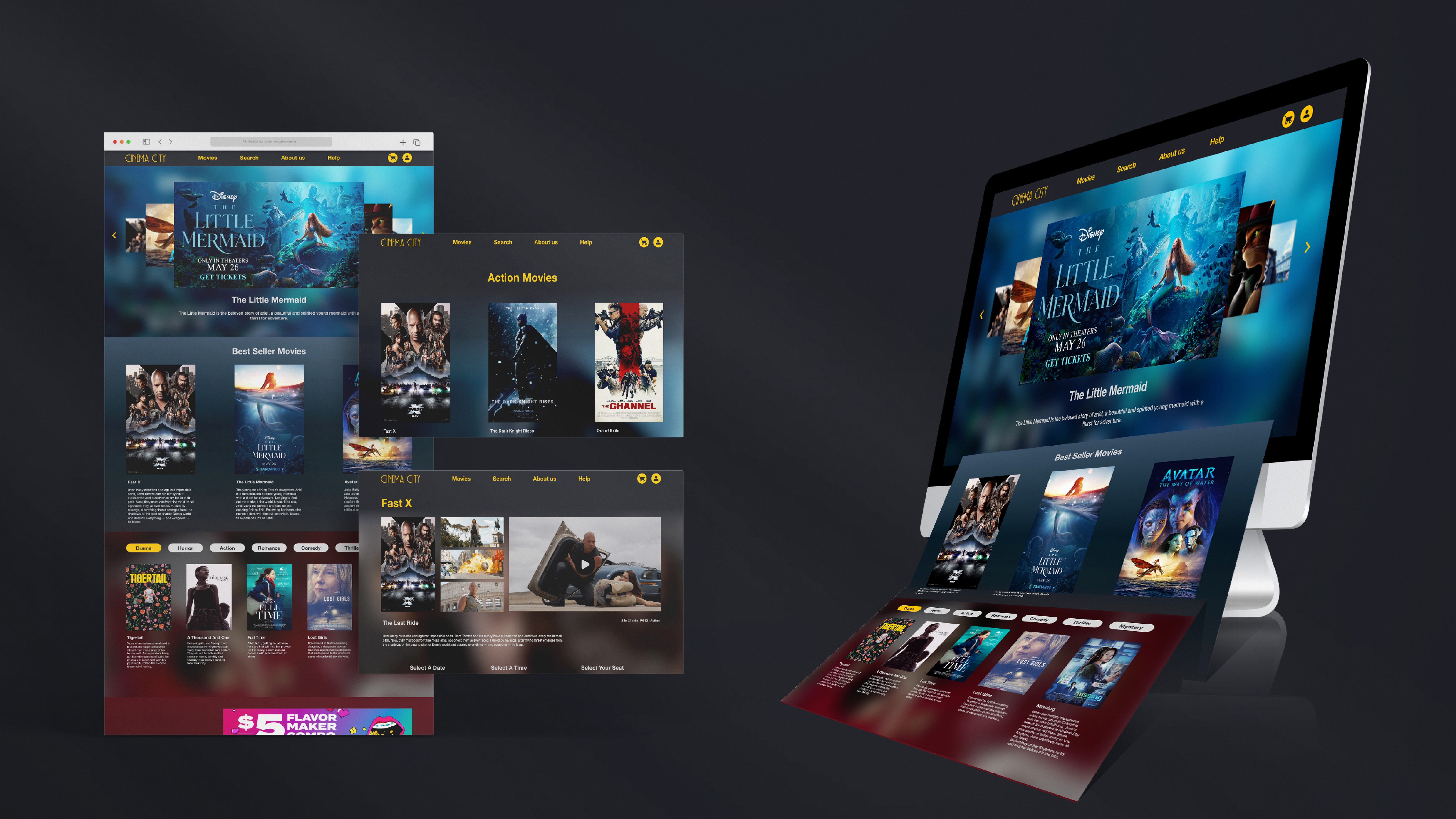
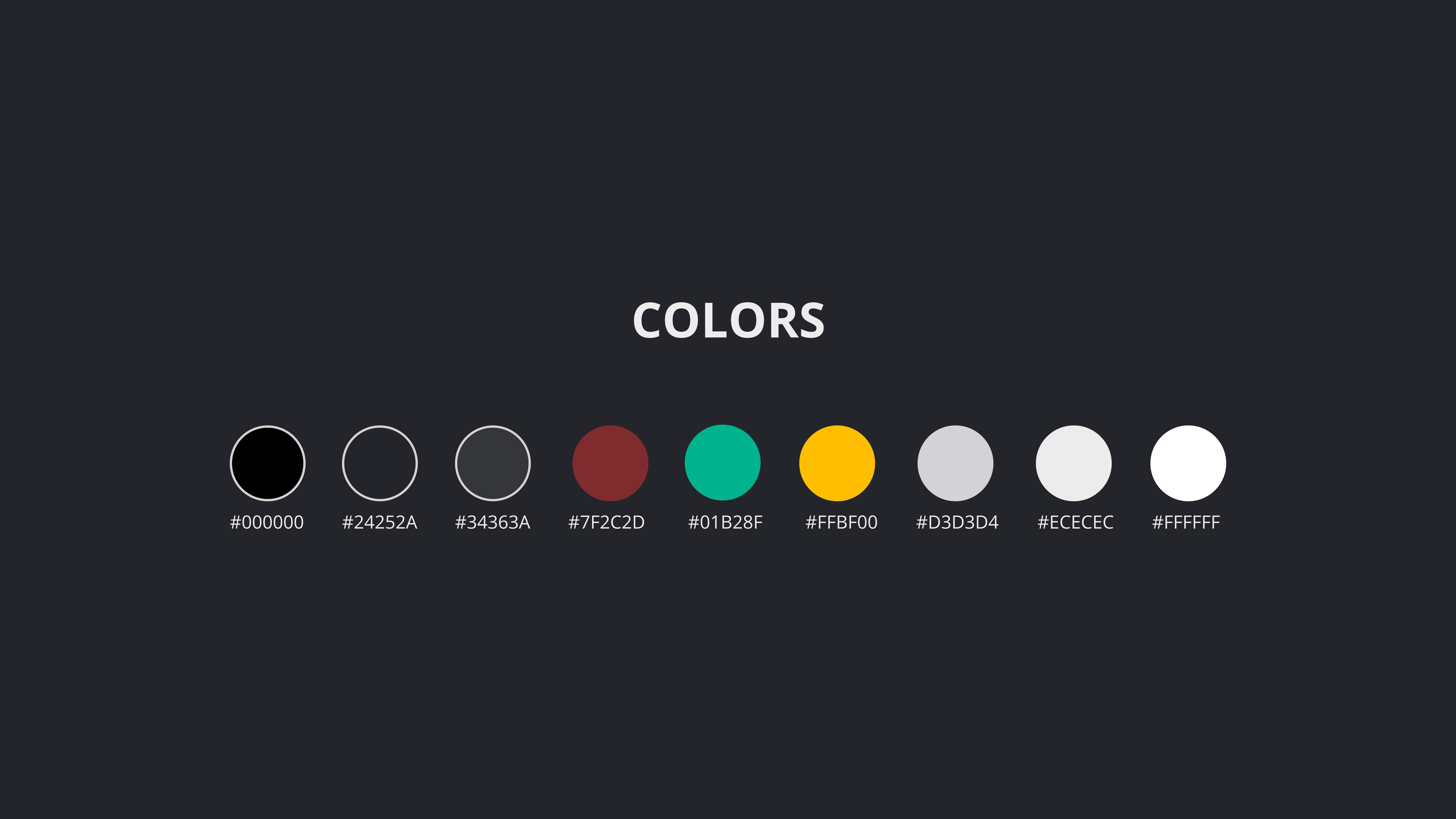
I built a high-fidelity prototype with a cinematic vibe—dark colors, bold fonts, and soft motion.
For the high-fi version, I designed a bold, immersive interface. I used dark backgrounds, neon-style accent colors, and sharp contrast to match the energy of a movie theater. Key flows like movie search, seat selection, and payment were tested for clarity and speed.
I also made sure the design was responsive. The experience was just as smooth on mobile as on desktop.
What I Learned and What’s Next
One Small Step for UX, One Giant Leap for Moviegoers
The final design wasn’t just cleaner—it felt like a real upgrade for anyone who loves going to the movies.
I saw how a small UX improvement—like a better seat map—could make a huge impact. Users shouldn’t have to think twice about booking a ticket. The final prototype offered a sleek, simple way to do it.
This project reminded me how powerful design is when it listens to users. And how even routine tasks—like buying a movie ticket—deserve thoughtful, joyful experiences.

